Brands of the World is the largest free library of downloadable vector logos, and a logo critique community. Search and download vector logos in AI, EPS, PDF, SVG, and CDR formats. If you have a logo that is not yet present in the library, we urge you to upload it. Thank you for your participation.


2 Comments
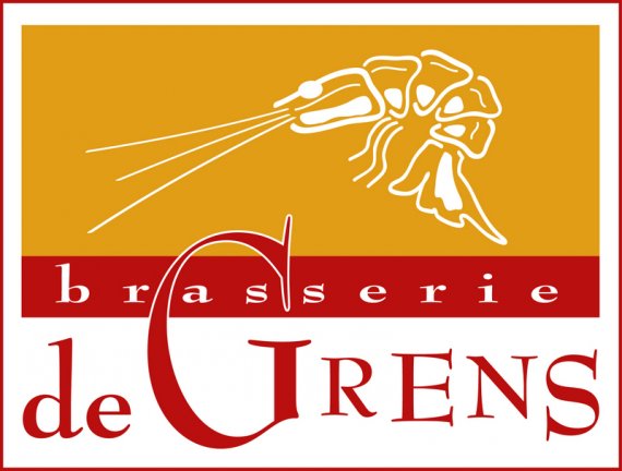
Okay, where to start, where to start.... I LIKE parts of this... Let's start with that. I like the prawn symbol, I think it needs some work (some simplifying, for example) but I think it could totally work. I don't mind the color combination you've got going- I think it works for a brasserie.
But! Yeah, there's a total 'but'.... The font -none of the fonts- are working for me. I especially don't like the G creeping up into the block above it with the white stroke- I think that whole situation has to go.
I'd start over with just the colors, the prawn, and the idea of 'brasserie' stretched out across over 'de Grens', that seems like a good plan. Also, I don't think you need the red stroke box around the whole thing, it just adds clutter.
Maybe just take off the red box, get rid of all of the text you've placed and start over from scratch with the typography- not doing any overlapping stuff, pick a cleaner font (maybe a simple/elegant sans serif for 'brasserie' and a classic looking serif font for de Grens!?)
Look forward to seeing more revisions!
The only thing I like here is the colors, you got that these are the colors you would want to use for a food oriented company. All the rest is totally mistaken. The frame should be thrown away, you should choose a different font, forget that hudge G, integrate the symbol to the logo....you should make another try.