Brands of the World is the largest free library of downloadable vector logos, and a logo critique community. Search and download vector logos in AI, EPS, PDF, SVG, and CDR formats. If you have a logo that is not yet present in the library, we urge you to upload it. Thank you for your participation.
Logo Restaurant
Mediagroep Venlo | Wed, 09/19/2012 - 07:44
Brief from client
Logo for restaurant
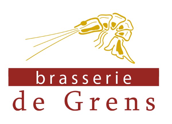
Much lighter... but still in doubt about the red band....
The lobster looks more like an alien shooting out some laser to kill an invisible enemy. You should make another lobster in a different position or align it with the text in a different way, e.g. from the side. The font is a disaster, two different fonts that don't go together. Also the large kerning is terrible. The red square makes no sense at all. Really awful stuff.
I think what oscar is (not so nicely) trying to say is that this still needs some work. I don't think you simplified the prawn at all, and I still think you need to. The fonts, while they are better than what you had before, still aren't quite right and they do need some serious kerning. The logo looks like it's kind of just floating out in space, not connected to the text at all.
So as for suggestions (oscar, knowing you'll read this- you clearly have a lot of opinions and things to change, but more often than not you don't give suggestions! I don't think it's fair to just rip something apart and not at least give a few little suggestions as to how to improve it!) I agree with oscar in that you need to find a way to connect the prawn to the text. The red box might not be your answer, because it's not working here. Kern that text closer together (this will also help improve the feeling of everything just floating), maybe stack it and then once the name of the place is established as a nice little rectangle, find a way to add the prawn (the simplified/cleaned up prawn!) and bring it all together!?!
Mostly I don't give instructions on how to improve things on purpose. If a critic goes to the restaurant, he will not want to teach the cook, just summerizes the mistakes and the likes in an article. I think it's the same with designers. A good designer will just need someone to take a look at the work with a fresh eye and he will know what to do about it. A beginner or an incompetent person might not figure out what to do but I really don't want to be a teacher here nor a client who asks for a thousand modification turns. I just don't think I should do that.
And forgive me if I sometimes sound rude, I don't mean to hurt anyone, it's just my style. I'm aware of it (that's why I chose this nickname) but I don't try to change because I enjoy it a little. It's a bit like red and green. They are wrong together but some people find pleasure in it:)
3 Comments
The lobster looks more like an alien shooting out some laser to kill an invisible enemy. You should make another lobster in a different position or align it with the text in a different way, e.g. from the side. The font is a disaster, two different fonts that don't go together. Also the large kerning is terrible. The red square makes no sense at all. Really awful stuff.
I think what oscar is (not so nicely) trying to say is that this still needs some work. I don't think you simplified the prawn at all, and I still think you need to. The fonts, while they are better than what you had before, still aren't quite right and they do need some serious kerning. The logo looks like it's kind of just floating out in space, not connected to the text at all.
So as for suggestions (oscar, knowing you'll read this- you clearly have a lot of opinions and things to change, but more often than not you don't give suggestions! I don't think it's fair to just rip something apart and not at least give a few little suggestions as to how to improve it!) I agree with oscar in that you need to find a way to connect the prawn to the text. The red box might not be your answer, because it's not working here. Kern that text closer together (this will also help improve the feeling of everything just floating), maybe stack it and then once the name of the place is established as a nice little rectangle, find a way to add the prawn (the simplified/cleaned up prawn!) and bring it all together!?!
Mostly I don't give instructions on how to improve things on purpose. If a critic goes to the restaurant, he will not want to teach the cook, just summerizes the mistakes and the likes in an article. I think it's the same with designers. A good designer will just need someone to take a look at the work with a fresh eye and he will know what to do about it. A beginner or an incompetent person might not figure out what to do but I really don't want to be a teacher here nor a client who asks for a thousand modification turns. I just don't think I should do that.
And forgive me if I sometimes sound rude, I don't mean to hurt anyone, it's just my style. I'm aware of it (that's why I chose this nickname) but I don't try to change because I enjoy it a little. It's a bit like red and green. They are wrong together but some people find pleasure in it:)