Brands of the World is the largest free library of downloadable vector logos, and a logo critique community. Search and download vector logos in AI, EPS, PDF, SVG, and CDR formats. If you have a logo that is not yet present in the library, we urge you to upload it. Thank you for your participation.
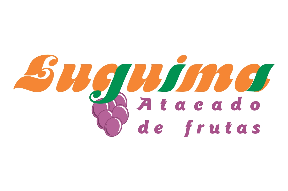
Luguima atacado de frutas
mauricio Hugo | Tue, 12/20/2011 - 20:11
Brief from client
Logo para atacado de frutas
Estou começando na área de designer gráfico.
Gostaria de opniões
has a lot of easy to understand - written for the designer who is getting started books, I am not sure about books in portuguese though. Try Amazon.com for that.
Obrigado. Amanhã tentarei novamente, Se não funcionar, vou estudar. hehe
sobre "g" seria para a uva e sobre "i" e "a", na verdade não significa nada, vou retirar as cores.
There are many ways a logo like this can be made to look awesome.
You took the strait forward route and it doesn't work as it should.
Your color scheme is fine, typography is passable but what you really need is a good creative idea about how to compose this together to make it look good.
7 Comments
Sorry, I know you are just starting out but this isn't working at all.
You will really need to study design/logo design before attempting to get into the field.
Ok, Obrigado, vou procurar alguns livros, me indica algum?
Pretendo fazer faculdade apenas em 2013
http://www.mydesignshop.com/
has a lot of easy to understand - written for the designer who is getting started books, I am not sure about books in portuguese though. Try Amazon.com for that.
Logo Lounge has some great books for inspiration.
Good luck!
I think it's a good idea to use some "funny" typeface in a logo like this one, but not this typeface.
You need more than just grapes to tell the world that you sell fruits. Add 2 or 3 more without saturate it.
I don't understand why parts of some fonts are green. Why specifically "g", "i", and "a"?
Obrigado. Amanhã tentarei novamente, Se não funcionar, vou estudar. hehe
sobre "g" seria para a uva e sobre "i" e "a", na verdade não significa nada, vou retirar as cores.
Good. Remember that in many cases a logo is a symbol, an abstraction of something that can be explained. Work only around meaningful things.
There are many ways a logo like this can be made to look awesome.
You took the strait forward route and it doesn't work as it should.
Your color scheme is fine, typography is passable but what you really need is a good creative idea about how to compose this together to make it look good.