Maple Creative
kayinvanderkill | Mon, 09/30/2019 - 16:56
Brief from client
This is a personal logo for my own design work. Maple is my last name.

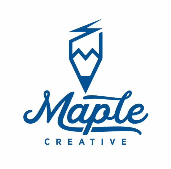
I wanted the symbol to represent the spark of creativity along with the most common instrument we all use to get the process started (well I still do anyway.) Originally I had the pencil combined with various lightbulbs, but I ended up just adapting it to an older concept I made with a shield. The shield turned into the pencil very easily and was far more simple and clean.
The text is Hanley Rough Script heavily cleaned up/edited to better fit what I wanted. The "creative" text is Gotham. I'm not sure if "creative" should be made bigger or if it looks good as is. Opinions on this and the concept overall would be greatly appreciated.


3 Comments
The symbol and the wordmark feels totally disconnected. Both are in a different graphic style that clashes with each other.
I'd remove the symbol altogether and keep the word mark with a bit more fine tuning.
The wordmark and the symbol are meant to be connected via the "symbol" drawing the "wordmark". Or at least that's what I was experimenting with. I have other versions without the wordmark at all, and yet another version with the wordmark in the original rough style and the same "rough and worn" look applied to the symbol so they'd connect better visually. However I prefer a "clean" look and not to mention that those are a lot easier to utilize for printing purposes.
I also debated between a pencil and a pen for the symbol. The pen better fits the action of "drawing" the wordmark due to it's styling, but I'm trying the pencil first because it has somewhat hidden "M" within the symbol.
self explained