Brands of the World is the largest free library of downloadable vector logos, and a logo critique community. Search and download vector logos in AI, EPS, PDF, SVG, and CDR formats. If you have a logo that is not yet present in the library, we urge you to upload it. Thank you for your participation.
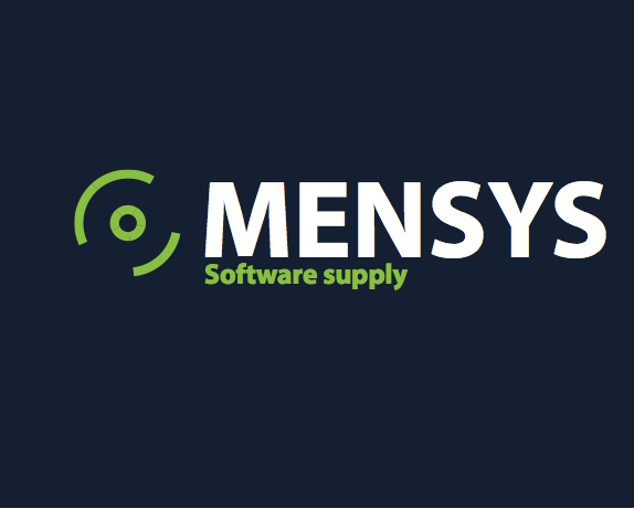
Do you have any say in the name of the company? It's regrettably similar to the word "menses."
Other than the unfortunate name, the typography is just Myriad, the default font when opening Illustrator, so right off the bat I can tell not a lot of thought went into this.
Is the symbol a power button, or something similar? That idea has been done for nearly every "software" or any "techy" type logo, so again, a little more thought could have been put into this. It also kind of looks like a breast, which I might only be seeing because I already thought of menses.
To me the icon looks more like a disc than a power button which I don't mind. It looks like the circle in the center is split into five segments, I would just have it be one solid shape. I would also use a font with a straight sided M to give it a little more sturdy of a feel. It seems strange that "supply" is not capitalized. I'd like to see it on a white background rather than reversed because usually a logo is used more in that fashion.
The company Mensys is a online software catalogue and the name unfortunately will not change because its been around since 1997 and its hard to change that.
The symbol supposed to be look like a disc thats because they sell software. I agreed with the typography and definitely will change that.
Yes you are right about the five segments and I will remove those.
And supply wil be capitalised.
There's A LOT more that you could be doing with this.
I thought that the symbol was a disc.. It probably is?
I don't like the way that the 'disc' is not centred vertically. If it's not going to be centred then it needs to be more obviously offset as it currently looks like poor workmanship.
The whole logo on the canvas is completely off centre, but hey...
...and Myriad...? I agree with jtrumm - it's the default font and needs to really earn its existence or risk been seen as a cop out.
I also agree with Jim regarding reworking the disc. It currently looks overly basic in my opinion and needs looking at.
Good luck though. You've got quite a good starting point here! :)
4 Comments
Do you have any say in the name of the company? It's regrettably similar to the word "menses."
Other than the unfortunate name, the typography is just Myriad, the default font when opening Illustrator, so right off the bat I can tell not a lot of thought went into this.
Is the symbol a power button, or something similar? That idea has been done for nearly every "software" or any "techy" type logo, so again, a little more thought could have been put into this. It also kind of looks like a breast, which I might only be seeing because I already thought of menses.
To me the icon looks more like a disc than a power button which I don't mind. It looks like the circle in the center is split into five segments, I would just have it be one solid shape. I would also use a font with a straight sided M to give it a little more sturdy of a feel. It seems strange that "supply" is not capitalized. I'd like to see it on a white background rather than reversed because usually a logo is used more in that fashion.
Thanks guys,
The company Mensys is a online software catalogue and the name unfortunately will not change because its been around since 1997 and its hard to change that.
The symbol supposed to be look like a disc thats because they sell software. I agreed with the typography and definitely will change that.
Yes you are right about the five segments and I will remove those.
And supply wil be capitalised.
Thanks!
There's A LOT more that you could be doing with this.
I thought that the symbol was a disc.. It probably is?
I don't like the way that the 'disc' is not centred vertically. If it's not going to be centred then it needs to be more obviously offset as it currently looks like poor workmanship.
The whole logo on the canvas is completely off centre, but hey...
...and Myriad...? I agree with jtrumm - it's the default font and needs to really earn its existence or risk been seen as a cop out.
I also agree with Jim regarding reworking the disc. It currently looks overly basic in my opinion and needs looking at.
Good luck though. You've got quite a good starting point here! :)