Mensys
John von Wells | Thu, 05/22/2014 - 10:48
Brief from client
Hello, what do you think of this logo I created?
What I did:
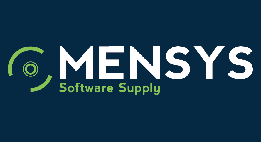
Centred the icon vertically.
Changed the font in to Nevis Bold.
Capitalised the "S" of Supply.
Align "Software Supply" under "MEN".
Resized the icon.
Tried to make the icon look more like a CD. The only problem I gonna have with this is when it scaled down but its about the idea.
Thanks for all de feedback I'am pretty new in this world and you guys really help me out here.
4 Comments
Looks better.
Two things though: first, the kerning is way off. Look at the last S which is running away. You need to fix that.
Second, I really don't like that symbol. The CD is really outdated now. In the era of the optical fiber and the Cloud, it's just an old technology. You might want to rethink the strategy.
Good luck.
I agree with Shawali, You need to design the logo to be future proof so it will still be relevant in years to come.
I like where this logo is going though!
I see nothing wrong with the symbol. Even if it is representative of an optical disc, that technology isn't going away any time soon. And it's abstract enough as drawn that even if discs go the way of the dodo, the symbol can remain.
The important thing about a logo is that it serves as a visual marker that is associated with the company it represents. It doesn't *have* to be a literal drawing of the products and services the company provides.
I think this version is much, much better. I agree that the kerning should be cleaned up but that's an easy fix. I'm not sure if I like the inner ring better with one or two circles but one circle might work better at smaller sizes. I like the way the lowercase y at the end of supply aligns with the N.
I also considered the idea of the disc being dated technology but I don't actually have a problem with it. To me it still represents what you're selling and even if the disc goes away, the symbol is still relevant.