MONICA APOSTOLO JEWELRY
Brief from client
jewelry, jewelry store.
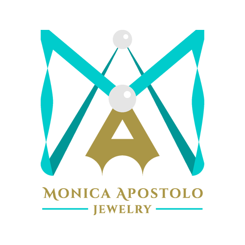
Monica my client, she love the ocean, pearls, and everything that comes from there, thats why I put that elements in the imagotipo, she uses that materials in their jewels also the colors palette, gold (luxury), grey (balance) and turquoise (ocean) made everything look more in the concept. The isotipo is a necklace that made the initials of Monica Apostolo, the "M" comes from the turquoise ribbon with movement and the "A" comes from the central gold pendant that have a orginal cuts. And last but not least, the typography have delicates curves that remember the waves of the ocean. This final version reflect her own style elegant, free and unique, and she approve.
Jewelry, Jewelry Store, Imagotipo
Here's another version of the Imagotipo Monica Apostolo Jewelry
Thank you all for your comments!!
1 Comments
I must say, I really like what you did with the word mark. It's much simple a graceful. For the subtext, I would have picked a different but complimenting font.
I'm really not sold on the symbol. It's way too complicated and overpowers the word mark.
Pro tip: the client being pleased with the logo doesn't make it a good one. I'd rather have a client pushing my creativity over and over than one agreeing on the very first thing I show him.