Brands of the World is the largest free library of downloadable vector logos, and a logo critique community. Search and download vector logos in AI, EPS, PDF, SVG, and CDR formats. If you have a logo that is not yet present in the library, we urge you to upload it. Thank you for your participation.
My logotipe
axelh | Tue, 02/18/2014 - 15:35
Brief from client
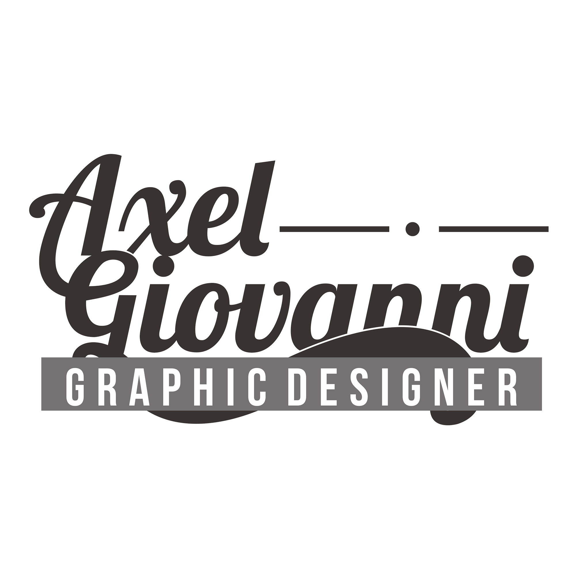
first proposal, for my own logo
I wanted to know if they can criticize my logo, to know what is wrong, and as if this could improve.
I feel that jack has some good pointers to start addressing.
The lobster font altho is cool and looks nice, does not help.
The big bold graphic designer over the name is also off putting.
and the line with the dots are very randomly placed to fill the space.
I would say sketch it out, get some good concepts going and take our best ideas and take those in Illustrator. :) Good Luck
The main issue I believe everyone is having with your logo is the disruption of flow with your text. You have soft swirly lines that literally "crash" into straight and direct lines. There is no true sense of balance and gives the user a sense of something that is out of place, which in this case is the line with the dot and the "banner" in front of the text.
Colors don't bother me atm so I'm giving a green thumb simply because your colors look fine in a grey scheme.. But thats just my opinion.
I say stick with the wavy theme and ditch all harsh and square lines. Also there is no true symbol, just text (and no, the wavy portion of giovanni doesn't count!). You want to have something that gives us an idea of what you're about. As Stephen said, get some concepts going and then you'll have a fleshed out idea of something that describes you.
Check out logopond.com for more inspiration. Keep at it!
5 Comments
sorry for my bad English :)
If you are a graphic designer you can't use lobster for your logo, just don't
the connection between A and G it's not very well made and not becaouse your AI skills, but it just does not "match"
you put the GRAPHIC DESIGNER title like trying to cover the wave. Is it because looks bad right? then delete it
I feel that jack has some good pointers to start addressing.
The lobster font altho is cool and looks nice, does not help.
The big bold graphic designer over the name is also off putting.
and the line with the dots are very randomly placed to fill the space.
I would say sketch it out, get some good concepts going and take our best ideas and take those in Illustrator. :) Good Luck
Also to add on to what Stephen and Jack said.
The main issue I believe everyone is having with your logo is the disruption of flow with your text. You have soft swirly lines that literally "crash" into straight and direct lines. There is no true sense of balance and gives the user a sense of something that is out of place, which in this case is the line with the dot and the "banner" in front of the text.
Colors don't bother me atm so I'm giving a green thumb simply because your colors look fine in a grey scheme.. But thats just my opinion.
I say stick with the wavy theme and ditch all harsh and square lines. Also there is no true symbol, just text (and no, the wavy portion of giovanni doesn't count!). You want to have something that gives us an idea of what you're about. As Stephen said, get some concepts going and then you'll have a fleshed out idea of something that describes you.
Check out logopond.com for more inspiration. Keep at it!
Very nice addition to the critiques!