Newest Version
Brief from client
I'm rather happy with this version, so I'm expecting negative feedback. Let it begin.

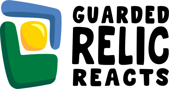
This one has a different font.
Inspirations are a comfy chair, a television, something old, something precious.
Meaning is in the eye of the receiver, and so I am putting what I can see after giving it time to sit. Not all of the concepts were conscious thoughts when creating, rather I was overwhelmed by how much I disliked the version I was being told was the best, but that I had come to detest.
These are the things I can see in this combination of shapes:
A. the green chair and the blue television casing & the yellow the screen
B. taking the image as a whole the yellow remains the screen and the blue & green together make the shape of an early upright television
C. the blue & green parts resemble cupped hands holding the precious yellow part
D. again the blue & green are hands, now forming L's of the thumb and first finger, being brought together and looked through with the yellow being the eye, as a director or cameraman do to assess the scenery when scouting a location.
E. the green is the box, the blue the lid, and inside is the yellow precious object
This is my rant, hopefully, I'll get some feedback to tell me if I'm wrong or right or somewhere in the middle.
The text like all the text I have used is just a holding piece that I will change when I spend time learning how to create typography.


