Brief from client
idealis, neat, complex but good looking, and different

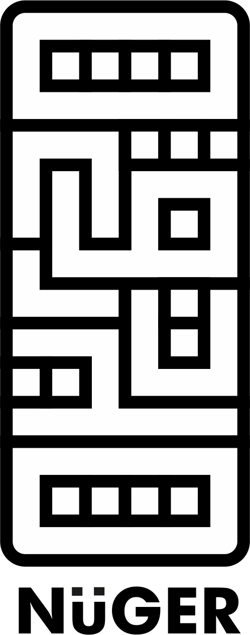
this is my personal logo, and the logo is the word of my name that i place it randomly N, U , G, R, O, H, O like the pattern of culture in many countries because i think the culture is very interest for me
7 Comments
Might have trouble in America with this one. lol It's a little close.
The symbol looks really cool though. It makes me think of a digital Mayan artifact.
lol, why this logo have trouble in America ?
Because it looks like a certain racial epithet.
HAHA! Bingo! I'm sure it's nothing even close in meaning but it did drop a hard "er" at the end. ;)
The name may have an issue in most of the western countries because phonetically, "Nuger" sounds close to..... The "n" word basically.. It's not your fault of course, but just keep this in mind if you plan to make logo that is to be accepted globally.
Anyways though this logo looks great! Nice and bold, and if you've seen any of my previous logos you'd realize that I'm a total sucker for bold lines. So you're probably wondering why I still gave a thumbs down for it? Well my only peeve is that it's extreeeeeemmlllyyy tall! If possible, is there a way to make it more horizontal then vertical? It could just be me in this though. I say this mostly because I am curious to see it in a horizontal format XD.
Also your name is nugroho? That's an awesome name! I see you also attempted to fit all the characters in the symbol, but be careful as your "O"s look like "D"s right now. A more colorful logo could help as well in terms of distinguishing the different letters. :3
I don't mind the white and black but perhaps you can play around with color as well. I recommend going into the pantone color book and picking some colors from there, I can imagine 3 colors being used here through out.
Type looks good except your ulamaut diacritic (the two dots over the U) seems to be a lighter black, a cmyk black perhaps? Simply make it the same color as the rest of your logo and text and you should be on your way :D
Keep at it!
thank you for all comments, i will comeback again with my logo which has been updated
I didn't real all the comments (damn you Giga with your super long comments!! =) But whats trikes me at first, is that you have a major problem of composition.
Just look at your avatar. Your logo is all squashed because is too vertical. It's better to compose it within a square or a horizontal rectangle. It'll be way more practical like this. Also, you got to know that one logo can have many different versions, mainly in terms of composition, so you can adapt it to whatever context it needs to be used in.
Good luck!
EDIT : I should have green thumbed the idea, the idae of the motif is really cool, but the symbol is way too big (think about leaving some wide enough margin around your logo when you upload it)