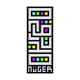
NuGER
NuGER | Mon, 02/24/2014 - 15:31
Brief from client
idealis, neat, complex but good looking, and different

like before ;D this is my personal logo, and the logo is the word of my name that i place it randomly N, U , G, R, O, H, O like the pattern of culture in many countries because i think the culture is very interest for me...
new ;
i make no rounded in the corner to make ''O'' and the colour i make it look modern, and try give a shadow


4 Comments
i digit!
I love the bevel and emboss (its a wonder im saying that :)
And i know this only gonna work on the web, but i love it anyway.
I don't think the name is gonna be a problem in Europe, it even sounds a bit German
ÜberCool!
This is a good step. I also LOVE the choice of type here, it works very well now :3
Interestingly I'm actually not a huge fan of the sharpness of this logo. But considering how your font is and the sharpness of all the other characters, it makes sense here, so it could just be me. Also I will have to play devils-advocate here and say that I don't think the bevels are necessary, since your logo already has great line-work and just poses another challenge to your logo's visibility in small sizes. Its not really that noticeable though so it's not that big of an issue.
For the colors, it's a colorful scheme, but I'm not sure about how well it looks as a whole. You have two warm and two cool colors in those squares, so there may be a bit of a clash there. I would check out dribbble.com and kuler.adobe.com to look at some better color schemes.
still waiting to see a horizontal version as well. Keep at it!
Another crazy idea i had. Oh well keep it up.
oh yeah thanks for the comment, i think its right the bevel is not necessery.
but for the horizontal logo is not a choice for me and your idea is too crazy for me lol XD