Brands of the World is the largest free library of downloadable vector logos, and a logo critique community. Search and download vector logos in AI, EPS, PDF, SVG, and CDR formats. If you have a logo that is not yet present in the library, we urge you to upload it. Thank you for your participation.
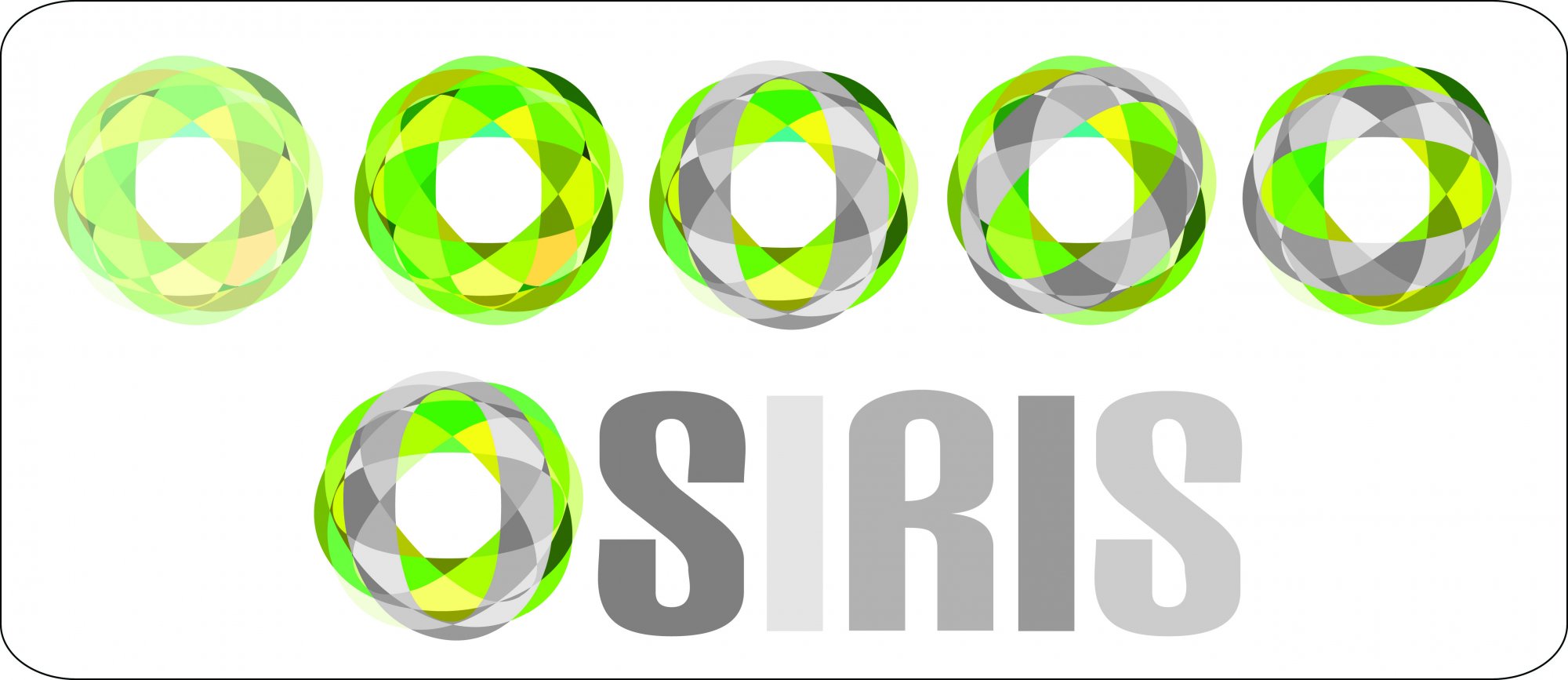
Way too much going on here and no brief to tell if any of it is appropriate.
The biggest issue you have is you designed it in RGB so these colors would not translate to print without spot colors. Attached shows your design as CMYK you can see how muddy the colors go.
Does anyone know if they teach design students the difference between RGB and CMYK any more?
Yes. Yes they do. Although I will say I surprisingly was not taught about this until my third year of photography. They had touched on it, but not really explained it much. So possibly this was a first year/early beginner not aware of it yet.
Unfortunately, doing a logo "just for fun", ie making one in 5 minutes, without following any proper creative process, is the perfect recipe for a disaster.
I agree with my two esteemed colleagues here, there's not much happening here. It's too random, messy and difficult to read (I read "siris")
Creating a logo for a made up company can be a lot of fun, but it doesn't dispense you from working hard on it.
5 Comments
The neon green/gray/white combination isn't very eye pleasing. I would also avoid using a mashup of shades of gray for the text.
Doesn't work for me, sorry.
Way too much going on here and no brief to tell if any of it is appropriate.
The biggest issue you have is you designed it in RGB so these colors would not translate to print without spot colors. Attached shows your design as CMYK you can see how muddy the colors go.
Does anyone know if they teach design students the difference between RGB and CMYK any more?
Yes. Yes they do. Although I will say I surprisingly was not taught about this until my third year of photography. They had touched on it, but not really explained it much. So possibly this was a first year/early beginner not aware of it yet.
Unfortunately, doing a logo "just for fun", ie making one in 5 minutes, without following any proper creative process, is the perfect recipe for a disaster.
I agree with my two esteemed colleagues here, there's not much happening here. It's too random, messy and difficult to read (I read "siris")
Creating a logo for a made up company can be a lot of fun, but it doesn't dispense you from working hard on it.
Good luck!
Thanks for your critiques guys.
I am not a student nor a designer.
I've uploaded version 2 so feel free to critisize again