Brands of the World is the largest free library of downloadable vector logos, and a logo critique community. Search and download vector logos in AI, EPS, PDF, SVG, and CDR formats. If you have a logo that is not yet present in the library, we urge you to upload it. Thank you for your participation.
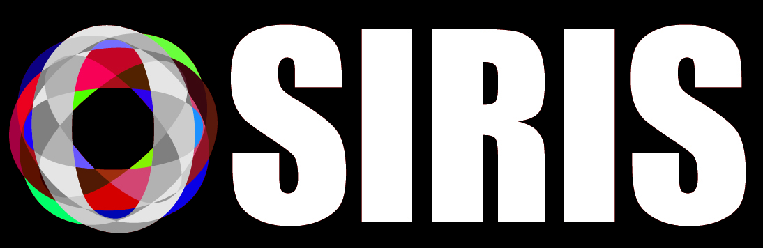
When you've got narrow letters, using a circle doesn't help unify the text very well.
Still not liking the color scheme you chose for that gyroscope thing. Everything about this logo just seems to clash. Plus, the shapes in that symbol appear as though they're supposed to be symmetrical, but they're not.
I know you're just playing around with shapes and this isn't a real logo proposal, but I'm not liking it at all, sorry.
Only if he used transparency and was printing from a pdf. If it was raster or/and had no transparency, every single one of my printers in my shop could handle that with ease.
We have a tool used for calibration, Its called the Datacolor Spyder. We have true monitor to printer color calibration. We are a digital printer though. I think you are referring to offset printing; then yes this could get quite trying to make it work; I could see it working with a minimum of three to recreate that onto a media using the offset method.
Yup familiar with that, we have a Xerox 1000i digital press in our facility, it has I believe two stations for spot colors or varnish effect. Still don't think our guys could hit that green in a standard print without a spot neon green.
We only have issues with reds to be honest, no matter how much calibration we do. To screen match red is still extremely difficult. Green are good we just sometimes can see the individual dots of the colors used to make up a green, but that is mainly just with a poopy forest green, neon comes out solid and vibrant.
Replacing a letter with a symbol is a bad idea 99% of the time. I am pretty sure most people will read this as Siris.
You said you were new, so I will give you this advice:
My list of things to do. (For first logos especially).
1. Research. - Look at logos. A bunch of Logos. Then some more logos. (here are some sites: www.logopond.comwww.dribbble.comwww.pinterest.com)
2. Brainstorm - Take your company name, as well as some of the things it stands for. Branch off from them, even if it doesn't make sense. Spend a good 30 minutes.
3. Pair the words, or pick words you really like. It doesn't need to make the best sense, or be from the same tree. If you have Dinosaur + cowboy - hey go for it.
4. Sketch some ideas. I would say about 6 of the pairs.
5. Pick the three that are working the best. Spend time on them. Sketch and refine.
6. Refine more.
7. Refine more more.
8. Turn on your computer.
9. Take the best of each of those 3 ideas and scan them in.
10. Bring us those 3 ideas.
11. We will help you from there. :)
But no computer work until we see some sketches! ^-^
(... One day someone is actually going to listen and bring us sketches.)
1. Try 2 colors only. Check our https://coolors.co/ for inspirations on color combinations that look well together. Also look at Logopond.com or dribbble.com for inspiration on logos.
2. Make the shapes opaque and THE FIRST color and the text THE SECOND color, remove the 0 that is horizontal and the one that is 45 degrees. You should be left with something like this (rough sketch warning).
3. Put logo at the top of your text instead of next to it, change font to something like Futura, Gotham, or anything from losttype or font fabric. Spell out the word "OSIRIS" with the "O".
4. Reupload so we can rip it apart again! Just kidding but hopefully that would get you towards a better looking design. Hope this helps :D
11 Comments
When you've got narrow letters, using a circle doesn't help unify the text very well.
Still not liking the color scheme you chose for that gyroscope thing. Everything about this logo just seems to clash. Plus, the shapes in that symbol appear as though they're supposed to be symmetrical, but they're not.
I know you're just playing around with shapes and this isn't a real logo proposal, but I'm not liking it at all, sorry.
The symbol would be a major rectal pain for any printer. Also, stay away from Impact, it's very dated and overused.
Only if he used transparency and was printing from a pdf. If it was raster or/and had no transparency, every single one of my printers in my shop could handle that with ease.
You wouldn't be able to match the colors unless you have the capability of adding 2 or 3 spot colors, correct?
We have a tool used for calibration, Its called the Datacolor Spyder. We have true monitor to printer color calibration. We are a digital printer though. I think you are referring to offset printing; then yes this could get quite trying to make it work; I could see it working with a minimum of three to recreate that onto a media using the offset method.
Yup familiar with that, we have a Xerox 1000i digital press in our facility, it has I believe two stations for spot colors or varnish effect. Still don't think our guys could hit that green in a standard print without a spot neon green.
We only have issues with reds to be honest, no matter how much calibration we do. To screen match red is still extremely difficult. Green are good we just sometimes can see the individual dots of the colors used to make up a green, but that is mainly just with a poopy forest green, neon comes out solid and vibrant.
Cool
Replacing a letter with a symbol is a bad idea 99% of the time. I am pretty sure most people will read this as Siris.
You said you were new, so I will give you this advice:
My list of things to do. (For first logos especially).
1. Research. - Look at logos. A bunch of Logos. Then some more logos. (here are some sites: www.logopond.com www.dribbble.com www.pinterest.com)
2. Brainstorm - Take your company name, as well as some of the things it stands for. Branch off from them, even if it doesn't make sense. Spend a good 30 minutes.
3. Pair the words, or pick words you really like. It doesn't need to make the best sense, or be from the same tree. If you have Dinosaur + cowboy - hey go for it.
4. Sketch some ideas. I would say about 6 of the pairs.
5. Pick the three that are working the best. Spend time on them. Sketch and refine.
6. Refine more.
7. Refine more more.
8. Turn on your computer.
9. Take the best of each of those 3 ideas and scan them in.
10. Bring us those 3 ideas.
11. We will help you from there. :)
But no computer work until we see some sketches! ^-^
(... One day someone is actually going to listen and bring us sketches.)
Symbol, typography None of this makes sense to me.
How about this,
1. Try 2 colors only. Check our https://coolors.co/ for inspirations on color combinations that look well together. Also look at Logopond.com or dribbble.com for inspiration on logos.
2. Make the shapes opaque and THE FIRST color and the text THE SECOND color, remove the 0 that is horizontal and the one that is 45 degrees. You should be left with something like this (rough sketch warning).
http://i.imgur.com/24GyuQN.png
3. Put logo at the top of your text instead of next to it, change font to something like Futura, Gotham, or anything from losttype or font fabric. Spell out the word "OSIRIS" with the "O".
4. Reupload so we can rip it apart again! Just kidding but hopefully that would get you towards a better looking design. Hope this helps :D