PainTrigger
BBBQ4 | Wed, 02/12/2014 - 10:14
Brief from client
Sideproject, a few products sold.
So... might as well put this up for pros.
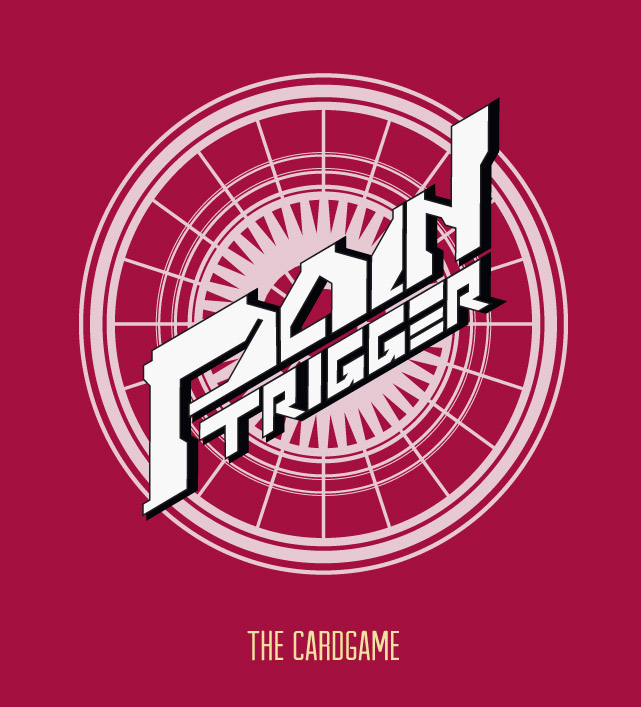
Its a logo for a casual cardgame called PainTrigger.
It sits on the backside of a card on a magical circle pattern and a red background.
The game itself is about futuristic and comical robots and mythical monsters, so I tried capturing the japanesque feel of trading card games such as Cardfight! Vanguard or Yu Gi Oh.
That is why this game is aimed towards the younger audience (16-30).
Edit. Red background added like in the real thing.
Edit. More info added.
4 Comments
Honestly it was hard for my eyes to focus on the logo, maybe with that red background like your description says it might read better, but overall i had a hard time reading it.
Eyecancer!
It's got a cool 80's video game vibe but it's so hard to read the word PAIN. The white in the background and foreground isn't doing you any favors either. Keep playing with it.
I agree with the above comments. You're going in the right direction, but right now, it's very hard to read. Coming up with your own custom lettering is really cool, but the characters have to be well balanced and proportionate all of which they are not in your logo. Just spend more time evening things out and you'll be alright.
Keep it up!