PainTrigger
Brief from client
Sideproject, a few products sold.
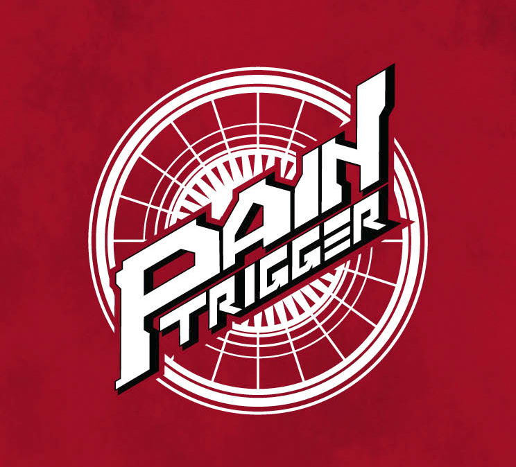
"ts a logo for a casual cardgame called PainTrigger.
It sits on the backside of a card on a magical circle pattern and a red background.
The game itself is about futuristic and comical robots and mythical monsters, so I tried capturing the japanesque feel of trading card games such as Cardfight! Vanguard or Yu Gi Oh.
That is why this game is aimed towards the younger audience (16-30)."
Here again.
This time I cleaned my things... I tried to mask the outer rim/circle to punch the logo out more, and I made the letters on the logo itself a bit more readable...
The circle is not a part of the logo! but it is a part of the backside of the card and once its done it cant really be changed...
Edit. I lowered some of the vector points on the P and the A by a mm to make it a bit more pleasing to the eye.
3 Comments
This revision came out good!
I like what you did to make it readable!
I keep seeing the letters almost resemble a gun, (sight on top of the N, P as the handle, the R as the trigger.) not sure if intended but interesting sub-consious part.
Thanks stephen *u*)b
Yes the font was supposed to be edgy and trigger(?) like but now that you say that it looks like a gun... it does :/ (it was not intentional).
I like it ! it´s consistent and has personality. I see the previous version and I can say you did solve lot of issues. I think it definitively has potencial!!