Phase Twelve Entertainment
Brief from client
Phase Twelve Entertainment is a startup independent media company specializing in all forms of audio entertainment. This includes audio mixing and mastering, music production, songwriting, and artist development. It is the intention of the company to conglomerate into subsidiaries that specialize in film, tv, & live entertainment.
We basically look at this company's brand as being one of inspiration and quality product and programming. We just need a quality brand logo to represent Phase Twelve in a positive and attention grabbing way.
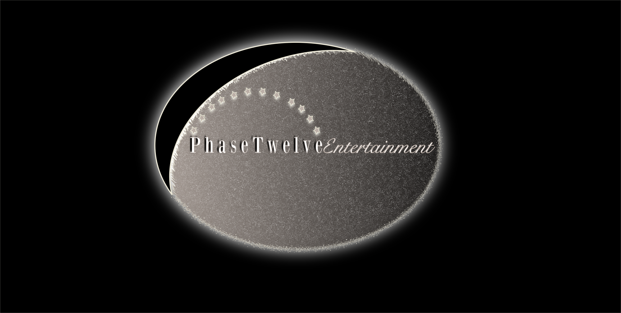
The idea of Phase Twelve was conceived based on the theory of evolution and spiritual epiphany. With this in mind, the idea of the logo here is to mesh together this idea of dual theories - one of science and one of religion. The logo depicts the moon towards the end of its phase coming to completion (the full moon). The title font is depicted in white and beige with a semi circle of stars over it which points to a reference in the bible of the Virgin Mary appearing in Revelations with a halo of 12 stars to bring about the ruler of the nations.
8 Comments
I am going to be frank with you... this is terrible. Not just one aspect but the logo as a whole. First and foremost you need to be using a vector based program for your logo design. I'll give you a thumbs up for idea as to not discourage you, because you obviously have a vision of what you want just not how to execute it. Good Luck.
Where to begin? Unfortunately, there is not one thing done right with this logo.
The word mark is barely readable. And the thumbnail version is totally non-legible. The two fonts really don't compliment each other. The drop shadow on "Phase Twelve" just complicates things even further.
It's never a good idea to have a long single-line wordmark inside a circle. You just find yourself with a lot of empty space around it and it just gets lost in the middle.
Globally, this is way too dark, gloomy and not appealing at all. All this black and grey is very depressing. Not the best choice for a media related business.
There are too many effects. First, you clearly made this on Photoshop or a pixel-based equivalent. That was your first mistake (I made the same one when I first started =) Logos should exclusively be made on a vector based software, such as Illustrator. Second, you're better off never using built-in effects and filters. They will more than likely make your logo look cheap and amateurish.
I have no idea where you get that Virgin Mary thing... You probably over think this one. Try to keep things simple and don't over-intellectualize it. It's just a logo =)
What you need to do is to apply a proper creative process, which goes a little something like this:
1- Research: know everything there is to know about the client, its business, how it works, the competition, what their logo look like, etc.
2- Inspiration: www.dribbble.com www.logopond.com www.pinterest.com You'll need a good inspiration fix to get into that creative groove before committing to anything.
3- Sketching: the most important part of the process, especially if you are new to the whole logo design thing. Sketch hundreds of ideas, whatever goes through your mind. This is how ideas will almost magically pop up in your mind.
4- Execution: once you're locked on a viable idea, you may switch your computer on. Spend some time testing some type combinations (no more than two). BTW, get yourself some typography and font knowledge: www.fontsinuse.com + a gazillion same minded sites.
5- Create several iterations of your logo. Don't get stuck with one unique version. You need to be flexible depending on what type of medium your logo will appear, may it be a website, a business card, etc...
I hope this will help. Good luck.
what soft did u use?.
I used Inkscape
This is a combination of:
-Poor font choices, as well a bad font combination
-Overuse of effects
-Blurry and unprofessional presentation
You really should simplify this tenfold. Draw inspiration from successful logos, and sketch until you're blue in the face. Then take your best idea to Illustrator.
This logo looks like it came straight out of a made for TV movie from 1989. Not a good movie either.
Do not give up.
I know you have gotten this advise already, but I will post it anyways.
You will get my list of things to do. For first logos especially.
1. Research. - Look at logos. A bunch of Logos. Then some more logos.
2. Brainstorm - Take the company name, as well as some of things that represent them. Branch off from them, even if it doesn't make sense. Spend a good 30 minutes.
3. Pair the words, or pick words you really like. It doesn't need to make the best sense, or be from the same tree. If you have Dinosaur + cowboy - hey go for it.
4. Sketch some ideas. I would say about 6 of the pairs.
5. Pick the three that are working the best. Spend time on them. Sketch and refine.
6. Refine more.
7. Refine more more.
8. Turn on your computer.
9. Take the best of each of those 3 ideas and scan them in.
10. Bring us those 3 ideas.
11. We will help you from there. :)
But no computer work until we see some sketches! ^-^
... One day someone is actually going to listen and bring us sketches.
Guys, I truly appreciate the feedback. To be honest, I am the business owner and I was being overly ambitious by trying to design the logo myself. I used Inkscape which is a freeware vector based program for those of you who asked. I definitely think it looks amateurish but I wanted my idea to come alive by having a hidden meaning behind the logo like some major companies. I also was trying to draw inspiration from logs like the one done by Universal. I will definitely go back to the drawing board. Thanks for being so honest everyone.
overall it's not appealing, and not readable. don't lose faith though ! it takes time sometimes to get things right