Phase Twelve Entertainment
Theo Bibbs | Fri, 01/08/2016 - 16:44
Brief from client
Phase Twelve Entertainment is a startup independent media company specializing in all forms of audio entertainment. This includes audio mixing and mastering, music production, songwriting, and artist development. It is the intention of the company to conglomerate into subsidiaries that specialize in film, tv, & live entertainment.
We basically look at this company's brand as being one of inspiration and quality product and programming. We just need a quality brand logo to represent Phase Twelve in a positive and attention grabbing way.
3 Comments
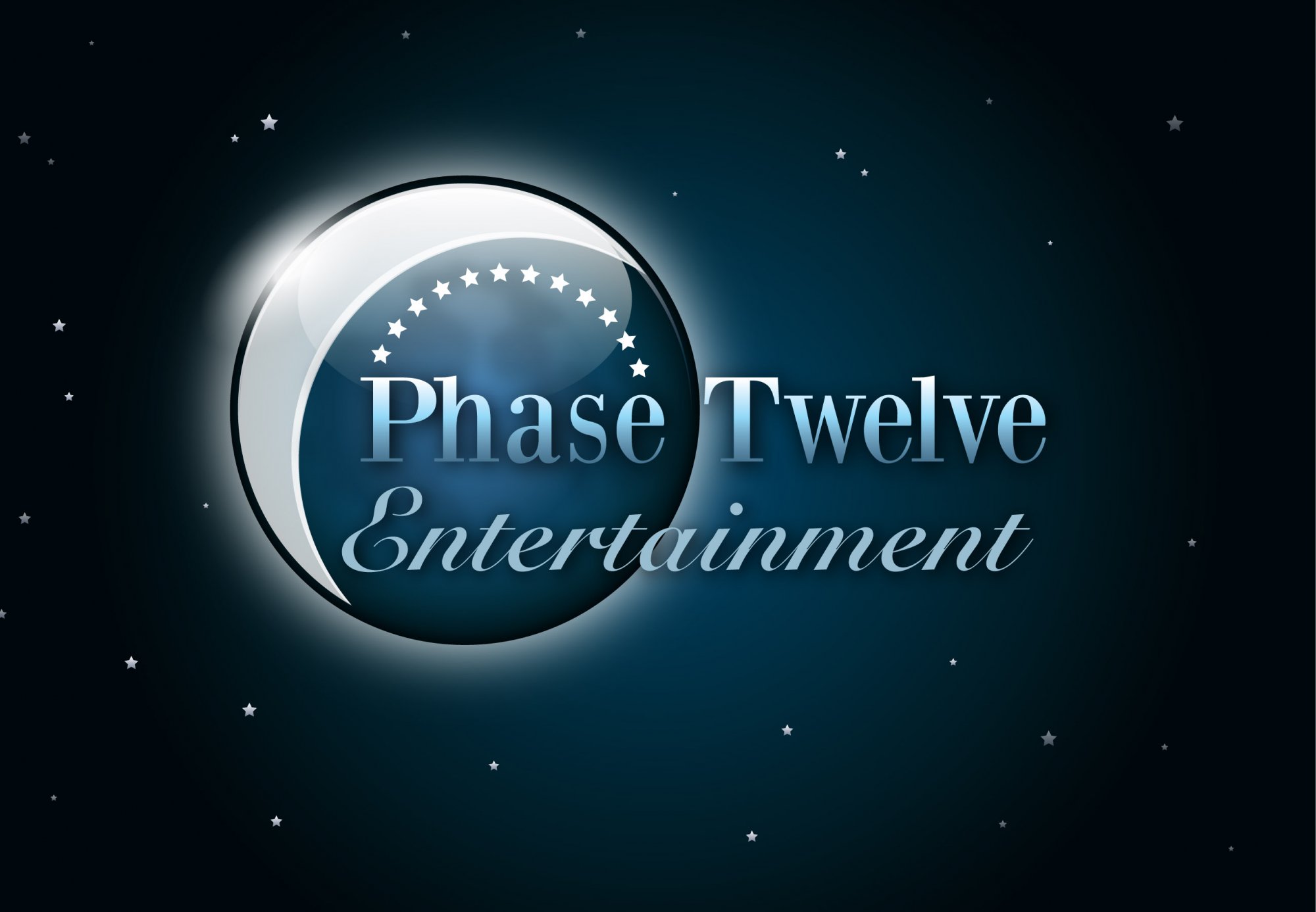
When i first looked at this it reminded me of watching the start of a film like E.T.
Now that is both a good and bad thing...
Good: It definitely has a general feeling about it that suggests Film and i can totally see it being displayed before a movie starts.
Bad: it looks dated, like around the date that E.T. was released (1982) Whats making it look dated is the fonts and more obviously all the effects that have been thrown on it.
Suggestions: Try out some different fonts that suit this day and age. Keep it simple to begin with, dont throw all your eggs in one basket and and spend loads of time developing a logo that doesn't look right from the start. I would take your 12 star / moon concept and play around with that - make lots of different symbols that use this idea, sit them nicely with some different fonts and see what works and what doesnt, take the ones that look like they are working and then develop them. Most importantly sketch some ideas out first before going straight on to the computer.
Good luck :)
Here's a really quick example that i did in about 4mins for you too see what I mean about keeping it simple to begin with
I really like that. I see what you mean.