Sands @ Saracen
Brief from client
We are starting a resort in Cambodia and would like to create a memorable logo for the resort.
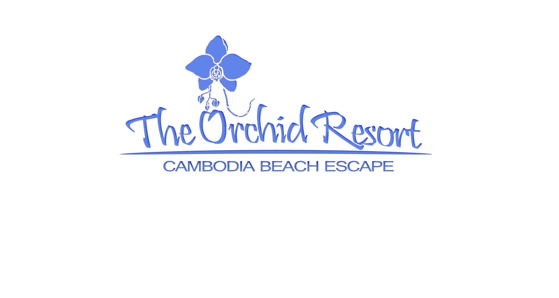
We've been tossing up between two names for the resort. This is the other name, The Orchid Resort". What I've done is create some dark blue contouring against a new teal/turquoise font color as per your feedback, and piece together an Orchid flower as the logo to go with the theme of the resort (we've planted a lot of orchids, and you said that I should put a logo that relates with the theme of the business!).
I also increased the font spacing and the distances between the text and the dividing line, and the logo and the text.
All great feedback that you've been giving me, so thanks very much.
What do you guys think of this version?
Thanks in advanced!
1 Comments
I think the overall style is quite good, but some of the fonts are are off. The second line of text should try to match up in font weight to the same as the line above. This will help the overall balance. It would be nice to have the second line with some more letter spacing.
The looks the part for how it should be, just concentrate on the all the small 1% to really bring this together.