Simple Cyber Defense
cbw1230 | Thu, 11/21/2019 - 22:09
Brief from client
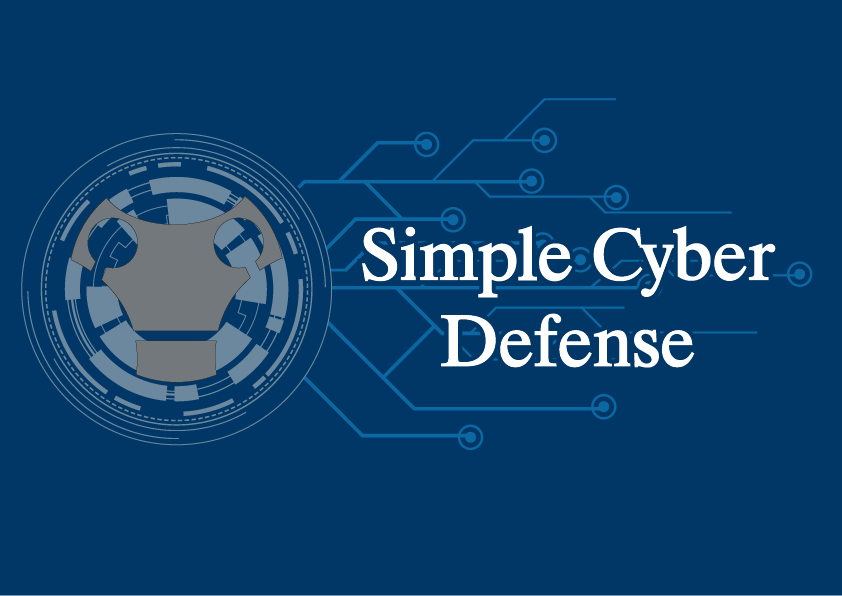
This is a logo for a potential YouTube Channel that will teach basic cyber security concepts in an easy to understand way.
This is a logo for a potential YouTube Channel that will teach basic cyber security concepts in an easy to understand way.
4 Comments
Before I try to give any feedback would you mind explaining the gray piston looking icon? I'm not super certain on what it is and what it represents currently. It may just be due to not being super familiar with this area of expertise.
The idea behind that was to try to use a theme like the Jarvis system from Iron man and the "face" was designed like a robot to try to get a sense of protection. I am not 100% sure if it works this this version so I am not sure that it will make it to version 3. In version 1 I had the robot face on a shield it was suggested that I remove the shield but keep the face. Hope that helps.
Yeah I'm not very sure on the robot. When I first looked at it I thought it was a piston of sorts or possibly an engine block. Once you said it was a robot I can see it a little better though it does remind me of a cyberman from Doctor Who. I would support the idea of just getting rid of it and trying something new. The face just doesn't mesh well and feels like a different style compared to the background elements. The circuits to the right should be good but, the circle interface may have too much detail that can be simplified and could be integrated into a new symbol.
As for the type I'm glad you didn't go for a cliche robotic font especially with how you already have a lot of cyber elements in the background. One thing to look out for is how the "C"is touching the "Y" in Cyber.
Overall I would say try for a new symbol and see what a more simplified version could look like for your background elements. Sometimes less is more. Especially for YouTube you have a relatively small space to work with for a channel icon so a lot of detail won't show up in that. This much detail could work for a channel banner but, you'll need a more simple icon for your channel icon.
You need to simplify this drastically. Get rid of all the superfluous. Just keep the essential, which in this case is that gas mask thing.
You also need to find another font, as a serif is at the polar opposite of what would fit this tech look 'n feel you're after.
Totally agree with Murawski on keeping in mind where the logo will be displayed. YouTube has very limited space and the main thing that will pop and give the channel its identity is the avatar pic, which is pretty small and require a very simple yet memorable logo.
Keep it up.