Sims Seller, Inc (2nd version)
j.o.y | Mon, 06/08/2015 - 23:28
Brief from client
Reseller of random goods- antiques, tools, perfume, vintage, kids toys- all kinds of items in other words. He sells on amazon, ebay, etsy, etc.
Wanted a "play off" of Sims game logo (see earlier version) and colorful.
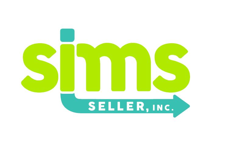
I'm not certain I am addressing the request for "colorful" here, but I don't see a lawsuit from Sims as a danger with this logo. (or ebay doh!)
Thought the arrow going "Thru" the name might signify goods he finds or inherits etc go from him and ship straight to the customer???
Please give feedback. I have to sell this over the first logo that he loved!
11 Comments
Way better since version 1.
This definitely has more personality than the Ebay/The Sims mash up you did last time.
I'm not really feeling the way the base of the arrow matches the bottom of the I. It makes two little spikes while all the other angles are rounded.
About the colors, they're not bad, a bit too acid maybe. Keep that green and try a darker blue, to create more contrast.
Anyway, you're on the right track here. Good job!
Thanks, I will work on color.
I'm together with Charlie on this version, but I'm going to bust your balls for a couple of execution errors : 1. don't like how you made that arrow coming from a bottom of " i " ( style, shape, composition ) - please move that over to a middle bar of " m " and connect without any space left over or your " i " becomes an " L " and make " m " in blue instead of " i "., 2. watch out for a bar of an "m " that connects to " i " - it is almost reads " n " - so, trim that curve a bit like you have done it on both " s "., 3. make the point of an arrow more modern, but not too complicated to visually catch right away.Hope that you don't mind my constructive critique , as I want you to sell your creation to a customer.
Thank you for the criticism, it is helpful! (and I don't have balls so thats good! ha) But would you mind clarifying what you meant by make the arrow more "modern?"
I will try the suggestion on the arrow moving to the "m" and see how it works. Thanks in advance for the help.
Sorry, I used an expression " bust your balls " not in direct way of course - but to make my point. Why I'm the only one who sees a four legged " m " the way it is connected between " i " & " m " and then a long, stretched arrow line makes it even worse. What I meant by saying to make a point of an arrow modern is to avoid your design being mistaken with " SUBWAY " logo that has an arrow pointing to the right, as well. I always love how " FedEx " incorporate their arrow in a negative space between " E " and " x " - that was superb. Now - do you see what I want you to do to sell your logo to a client?
I still a fan of your first version only for a sake of vibe and movement which your second version is completely lacking and looks an okay logo at the moment.
Agree with Shawali on the neon colors and the curve coming from the "i". I'm very much impressed with this version compared to the others, a lot more personality in this one.
I disagree with moving the arrow. The only letter it makes sense to use it on is the straightest one, which is the "I."
I would also make "seller" and "inc" consistent.
Great work!
Ditto what these guys said. I think a nice ocean blue would work fantastically with this (a bit of green in the blue). Moving the arrow would be a mistake. It would be too short and look choppy. There is a nice simplicity to this! As for "selling" it to your client, tell him this is a timeless logo and while you originally liked the first one, you realized it was too trendy for selling antiques.
I think this way it would work better in my humble opinion. Why am I the only one who sees a four legged " m "- the way it is done ( I read " sinms " ) , which is too confusing for my taste. Also, as an idea you can rotate that box ( top of a lower case i ) throughout a middle bar of " m " all the way down to a top part of arrow symbol to make it more interesting and logical, as a product being sold and out the door it goes to a customer. Hope that it will help you, good luck!
Well you may see a 4 legged M, but what I see here is "SINS" (and /or "SMS") and that is not the name! Though I value constructive criticism, I may have to "bust your balls" a moment! =)
The layout is now off balance, I like how all my lines and arrows aligned, creating a nice box shape for the logo. I do like your color, but not a fan of the arrow head. And I think completely omitting a letter out of a company name would be bad- very, very bad. I don't think it adds logic, I think it complicates.
I will upload my changes soon as I can.
Thanks.
Much better than the replica version of the Sims that you raised before.