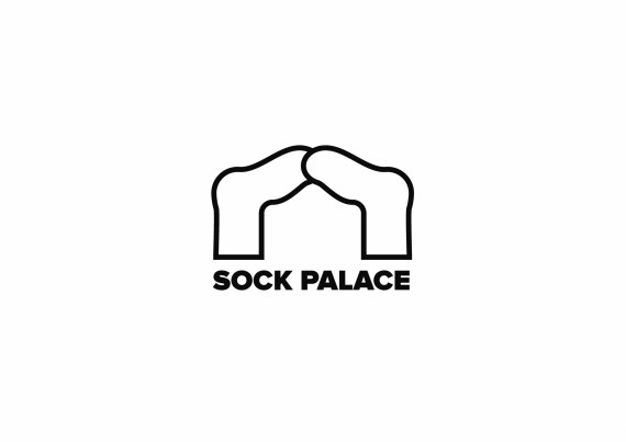
Sock Palace
Gabriel Carvalh... | Tue, 11/06/2018 - 20:29
Brief from client
A graphic sock store. They are targeting males between 15 and 30. They want it black and white so they can use it on the socks (I might make some colors variations anyway, though).

I'm using the negative space between both socks to make an abstract palace. Chose to go with black strokes and white. Maybe it is too simple for a graphic sock logo? That is why I'm choosing a few color variations for the client once I decide on the main version. I've tested it on a few mockups and it is functional.


1 Comments
Too simplistic indeed. I don't see any palace here. Keep sketching ;)