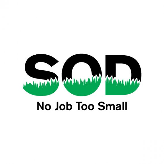
SOD No Job Too Small
JonAtkinson | Wed, 08/07/2013 - 20:56
Brief from client
The client's suggestion was using the "O" to have grass running through it similar to the red and blue stripes curving up the "O" from the Obama presidential campaign. This is my first preliminary stab at his idea and I'm trying to think of different ways to take it. It's going to be on trucks and embroidered on shirts as well so I'm trying to keep it simple without being too plain. I just started this today in between projects so any feedback is appreciated.


6 Comments
here an idea i played with.
Looks awesome! I do have to keep "No job too small" prominent because it's actually part of the name but they like it to read subservient. It communicates quicker when you see it on their coroplast signs they stick in lawns by the road. I'll keep playing. I love the colors.
I think that's too much
I think the second version is the best so far
I like this version.
I'd remove the white stroke around the grass, though.
I like this logo. Perhaps, is to streamline or simplify the display of grass. Work with color. This logo will work.