Brands of the World is the largest free library of downloadable vector logos, and a logo critique community. Search and download vector logos in AI, EPS, PDF, SVG, and CDR formats. If you have a logo that is not yet present in the library, we urge you to upload it. Thank you for your participation.


10 Comments
yep yep yep! done in my opinion!
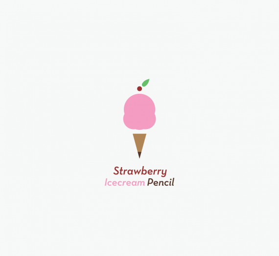
THis is a dope logo! I like it a lot, my only idea is to try what i did to the pencil cone =)
This looks great to me, except for one thing. There are too many colors in the company name. You probably could go with one only. Not the pink:)
This is good. A few comments: I might like to see more detail (as in cut out space) distinguishing the top scoop. Is ice cream supposed to be one word? I agree with the number of colors in the name. One color would look better (probably the cherry color).
Looks like you did it. It looks fine as it is.
Much better!!!!
No need to say more, looks nice!
It's ok to me.
Nice work, but you have too much minimalism, you have for graphic elements in your logo, that is heavy.
You said it's too minimal AND too graphic heavy? Please elaborate on what you mean. Hmm doesn't seem heavy I think, but I appreciate your input nonetheless.