Brands of the World is the largest free library of downloadable vector logos, and a logo critique community. Search and download vector logos in AI, EPS, PDF, SVG, and CDR formats. If you have a logo that is not yet present in the library, we urge you to upload it. Thank you for your participation.


8 Comments
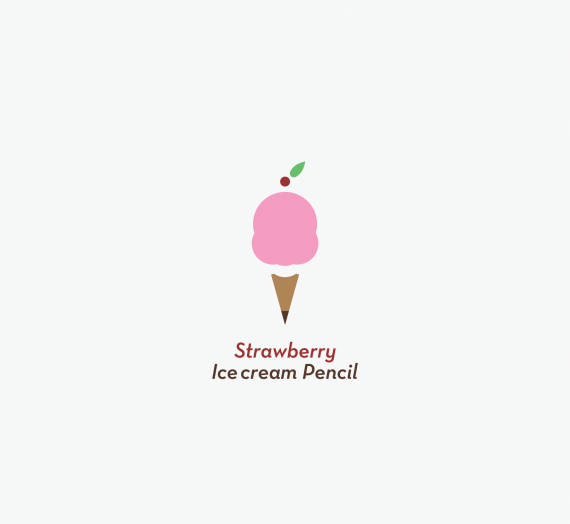
I like the new colors in the name as well as the scoop out of the pencil i think it ads the "Cherry on Top" ;)
no need to say more - great job!
logo liked minimalist
I scream at max :D.
Congrats
I don't like the italic font, I'd try something different, something heavier and not italic. I also don't like the flying cherry on the top. It breaks the whole thing apart and draws the attention away from the main idea, the pencil. Maybe integrated to the ice cream it would make more sense or just dropping it could be an option too. With a stronger typography you would probably not miss it.
Well that's not what you said in the previous revisions LOL but thanks anyway for the input :P
Fantastic! I love the 2D design and the typography is perfect. I like the italic font, it fits well with the concept. It's kind like how you feel when you eat ice cream, all gooey inside because it's so good :D Very well done!