Brands of the World is the largest free library of downloadable vector logos, and a logo critique community. Search and download vector logos in AI, EPS, PDF, SVG, and CDR formats. If you have a logo that is not yet present in the library, we urge you to upload it. Thank you for your participation.
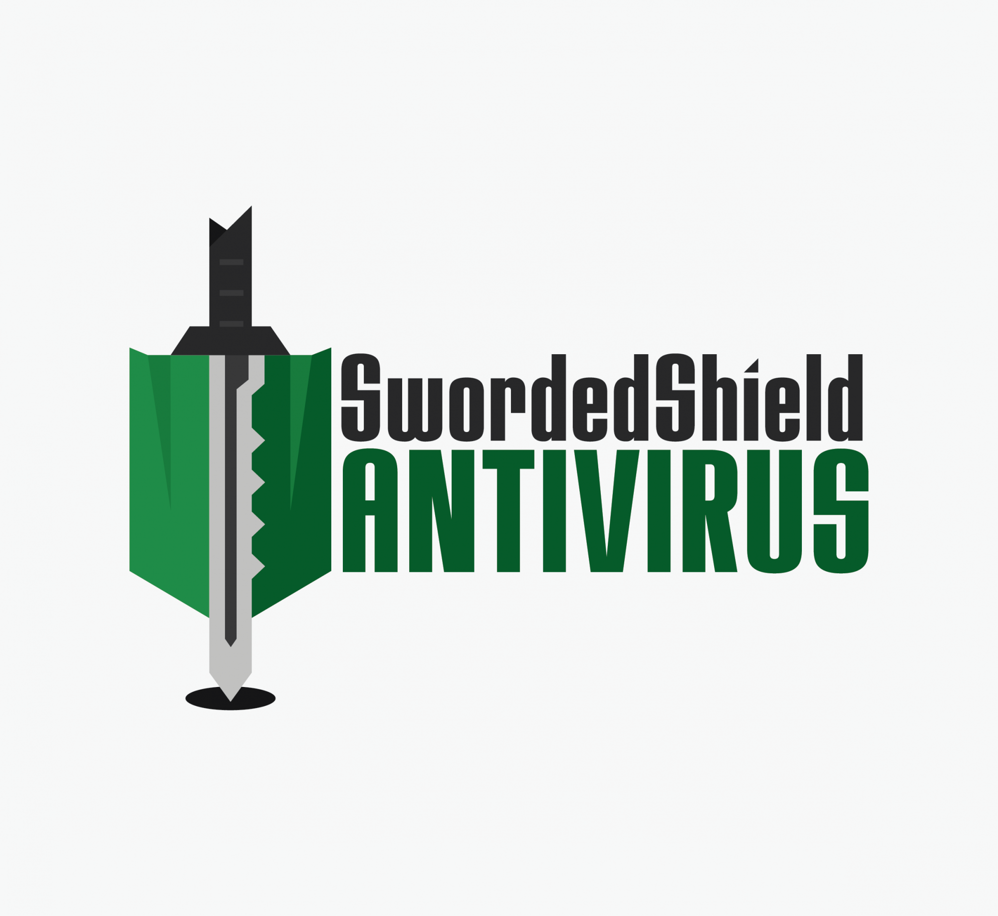
Lol yeah, I kinda preferred the sword from the first one, but after some of the comments on how it looks too "Legend of Zelda" it made a lot of sense so I went with something a little more "Key-looking." I think this one is a tad more professional however so I think I may stick with this "style".
I like this a lot. The sword looks unique and the font is a lot better than your previous choice. I'm not sure if I like the shadow underneath the sword and shield, but it's not a deal breaker for me. I'd also consider putting a little bit more space between your text and your symbol, just to see how that looks, It's a bit tense atm. All in all I really like it though :)
I was wondering what those teeth on the sword meant, until I read "key-looking" so- don't know if other people will recognize it as a key, especially when the word "sword" is in the title... I think the typeface fits nicely. Maybe put more silver effect in the shield.
hmm i think the bites out of the sword can be toned down a bit and maybe lower the shield just a tad so the sword can breath at the top?
I like overall but needs some minor touches here and there!
7 Comments
hmmmm... i think you have to work a little on the fonts, a little on the green also. something is missing and i really dont know what... :S
PS: I prefer the first sword
Lol yeah, I kinda preferred the sword from the first one, but after some of the comments on how it looks too "Legend of Zelda" it made a lot of sense so I went with something a little more "Key-looking." I think this one is a tad more professional however so I think I may stick with this "style".
I like this a lot. The sword looks unique and the font is a lot better than your previous choice. I'm not sure if I like the shadow underneath the sword and shield, but it's not a deal breaker for me. I'd also consider putting a little bit more space between your text and your symbol, just to see how that looks, It's a bit tense atm. All in all I really like it though :)
Thanks! Will definitely look into that :D
I was wondering what those teeth on the sword meant, until I read "key-looking" so- don't know if other people will recognize it as a key, especially when the word "sword" is in the title... I think the typeface fits nicely. Maybe put more silver effect in the shield.
hmm i think the bites out of the sword can be toned down a bit and maybe lower the shield just a tad so the sword can breath at the top?
I like overall but needs some minor touches here and there!