The Runaway Diner
Van Buren | Tue, 04/10/2018 - 17:59
Brief from client
This is a fictional diner that takes place in Vermont.

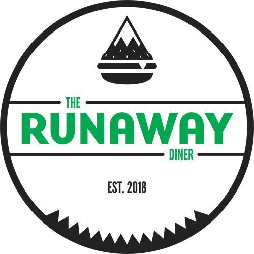
Went through many different iterations of this logo and landed on this one for the final. Tried going for something a bit modern while still calling back to some aspects of a diner aesthetic, without leaning too far into what you'd expect.
Something still feels off about it, but maybe I've just been looking at it for too long. Have at it though, and thank you for any feedback.


9 Comments
Well hopefully this does not sound to harsh, but here goes. The burger is definitely not appetizing to me. It's pretty awkward with the mountains and then the sesame seeds. Kind of a turn off (no good to be turned off by a food illustration for a diner!)
Second, I don't see the need for the jagged "teeth" at the bottom of the circle. I can't imagine what importance they would signify?? Ditch em.
Third, I have always been told that "Est." is usually best used when a business has been around for many years (typically at least 10). So not sure you need that either.
So what does that leave- the type. And in my opinion the type is the best part of this logo. I like the font for Runaway- esp the letter A's.
So I need to ask the purpose of the name "Runaway?" Because if it is important- there is nothing here that seems to reference it. Maybe it would be beneficial to go back to word mapping/sketching stage- and work around the nice typography that you have.
I'm sure this was a bit defeating- but do keep at it!
Just curious, is this a school project?
By all means, be as harsh as you want to. Rip it apart. I welcome honest critique if it helps me. I've been mixed on this logo for a while now as it is.
Making the burger symbol work was one of the difficult parts. I remember it popping up in my head and thinking it was the greatest idea ever. However, when I found myself staring at it for too long I kept thinking just how much trouble people could probably have looking at it. It initially didn't have sesame seeds, but I later added them to make it more apparent it was a burger. Still fairly mixed on all of it.
One of the initial parts of my concept was adding a triangular pattern to subtly allude to what is a mountain range, referencing the Green Mountains of Vermont. Initially, I had planned on also utilizing them in the rest of the brand design. However, as I am currently working on the menu design for this, I find myself not actually using them at all. I can easily ditch them if they're that unnecessary.
Honestly, I added the Est. because I needed that space filled within the circle, but perhaps the removal of the circle in general could also just fix that.
I chose the name "The Runaway" as a reference to an old painting that depicted a diner setting, while at the same time, playing on this idea that this diner, like Vermont as a whole, is a small town, quiet state. Almost a place you'd run off to if you were looking for peace of mind amidst the mountains of Vermont. Thus, the Runaway Diner is born.
And yes, this is a school project.
What is with all these people having really cool burger symbols, and ruining them with an unnecessary sign shape surrounding the entire logo.
You're the 2nd or 3rd person i've seen do this.
Kill the circle, it does nothing for you, that burger is way cool and should be the main focus. For sure.
lol I just posted my dislike for the burger! I think it's weird. IMHO
I don't mind the burger. Vermont is super mountainous, and is especially known for the Green Mountains in the Appalachians. Could it use some work? Sure, maybe more than just one peak, but in context, it doesn't bother me.
But I agree with you on the circle, that whole thing just needs to go.
Doing research on some vintage logo designs, the shape surrounding the logo and word mark seemed like a usual trend, especially among diners. While I am going for a bit more modern look with this, I still wanted to have some kind of call back to it being a diner. Nevertheless, the circle (along with the burger symbol) was one of the biggest things I was mixed on keeping around. I can easily remove it.
Thank you for the kind words regarding the burger symbol at least. However, I'm still mixed on it. Are the sesame seeds too much or would that take away from it being a burger? Should I separate the mountain and burger? All questions I've asked myself and all things I've tried, and I just don't think they work.
I am with Joy...don't care for the burger at all. It looks like a mountain sat on a strawberry and crushed a hamburger, or an upside down ice cream cone. The bounding circle is so totally unnecessary and very distracting. If you ask me, get rid of the circle, the strawmountger and the est. 2018 and keep the rest. That part I like, but I would make diner a titch larger.
When I initially looked at it, I thought that the burger and mountain symbol was an icecream cone combined with a burger. I think that is where a few of the other reviewers got confused too.
I agree with the first reviewer on alot of the rest of it the jagged teeth need to go and the "est." needs to go too. I would also suggest making "the" and "Diner" bigger because of all the extra space that you have above and below the main runaways text.