The Tortoise Group
Mystilik | Mon, 01/12/2015 - 00:11
Brief from client
For my older brother on a new company which he is unable to give men more details on as its to be a secret, and desired to have a tortoise for its logo.
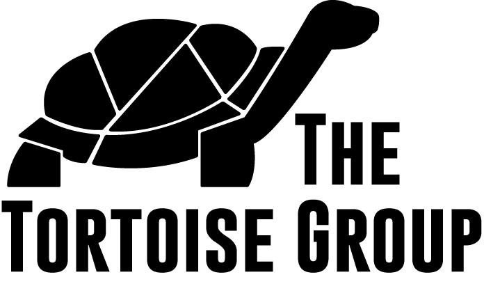
So the company is a consulting firm, and thus far he like the final look for the logo.
Still waiting to hear back on his opinion of the Font placement, I believe going bold for the font will help keep it similar to the logo.
As always, opinions and thoughts are greatly welcomed!
2 Comments
I think you're getting much closer. A few things:
Make "The Tortoise Group" all one line. Breaking up text like that is a poor typography practice for words like "the."
Also, I think your tortoise works for the MOST part, but I'm not sure about some of the details, such as how the back of the front leg cuts off where it meets the shell. The rear leg has a subtle notch, and could be better separated at the curve of the chest, I think. If that makes any sense.
Finally, adding the texture to the shell helps a lot, but the way you have it now doesn't make any sense, unless you were being "artsy" with it. It might be worth looking at.
Good improvements.
Waaay better than the others. Good job on refining. The type positioning is the only thing I would change. Can you try "the" sideways in front of the "T" in Tortoise maybe? It looks plain all on one line but don't like the break up either. Or maybe line up the back leg with the "T" and put "the" reversed in the leg? Just a suggestion. I would play around with it a lot.