Brands of the World is the largest free library of downloadable vector logos, and a logo critique community. Search and download vector logos in AI, EPS, PDF, SVG, and CDR formats. If you have a logo that is not yet present in the library, we urge you to upload it. Thank you for your participation.
Theo Logix
TheoLogix | Tue, 06/17/2014 - 21:21
Brief from client
new transportation company, merging two logos together, deer and the theo logix word.
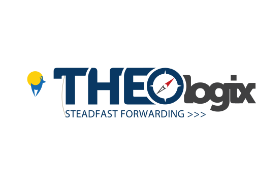
I like the colors but it reads "THEObgix" make it easier to read. I don't understand if you are including the deer just to show what the old logo looked like? The two elements are still separate so if you are trying to merge them into one harmonious piece then continue working on it. It's too bust right now, simplify! But good start, def in the right direction!
See the problem? On a white background, the flag disappear and you're left with an antelope floating about...
I think you can salvage this logo by removing the flag altogether.
Ton end on a more positive note, the font work is slightly growing on me now. It needs a lot of tweaking, but it kinda gives the whole thing some personality.
3 Comments
I like the colors but it reads "THEObgix" make it easier to read. I don't understand if you are including the deer just to show what the old logo looked like? The two elements are still separate so if you are trying to merge them into one harmonious piece then continue working on it. It's too bust right now, simplify! But good start, def in the right direction!
So many things happening. The dear and the circle, the compass, the hairline under the T and the forward arrows. You should concentrate on one thing.
I think this can be a good one, you worked on the type, which is good, but it needs to be easier to read, and I think the font choice is not helping.
See the problem? On a white background, the flag disappear and you're left with an antelope floating about...
I think you can salvage this logo by removing the flag altogether.
Ton end on a more positive note, the font work is slightly growing on me now. It needs a lot of tweaking, but it kinda gives the whole thing some personality.