Brands of the World is the largest free library of downloadable vector logos, and a logo critique community. Search and download vector logos in AI, EPS, PDF, SVG, and CDR formats. If you have a logo that is not yet present in the library, we urge you to upload it. Thank you for your participation.


7 Comments
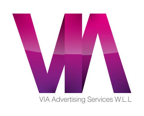
This logo looks great. The only problem I see is that the reflection should be continous in spite that it has the 3d depth. Lot better than the first version. Great stuff.
Much Better! i think the reflection is correct how you have it, it helps emphasis the 3d effect
Many Thanks :)
This looks pretty good, but I think you should make the reflection less visible on "V" and "A" (check the attached photo to see where) because those 2 letters are behind the " I " also the reflection should be continous because this is a front view, not perspective.
Nice about the symbol, but, the typography below… i feel it weak and not very good integrated, also, you need to add the last period. I'm with you if you are ok with the light typo, but it should be better proportionated (the rule says a third against the symbol)
Is not necessary to repeat VIA in the second part, the first one is excellent and sufficient.
About the reflection, i think is a great idea, and if you made it a little bit noticeable could be better, in order to represent a decision and not an omission.
Hope this help.
Many thanks again this comments help me allot :)
Love it. I would adjust the reflection on the "I" a bit more to emphasize the depth, but that's just a person pref.