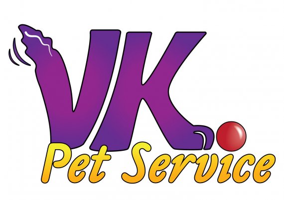
VK Pet Service
Jframe2002 | Wed, 10/19/2011 - 22:08
Brief from client
Should be fun and inviting, and VK should be part of the logo.

This is the newest version. I made changes based on a few suggestions. I personally like this one a lot better. Thanks for the tip about the 'i" and the ball. I made the tail more... fluffy/bushier.
I also added some motion to the tail... do you guys think that the motion lines and the ball make it to busy? Thanks again for all the tips and help.


1 Comments
I hate the colors. Looks like a clown show. Sorry, I don't mean to be rude.
The symbol has improved, but I still have hard time making out the dog.
The yellow type would work better with a simpler font.