WAYKN
Brief from client
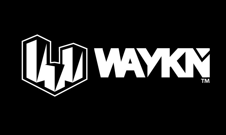
This is my own brand for clothing and other art over all. I know you may be thinking this looks like crap but I know, It needs refinement. The lettering is something I want to keep because it's kind of it's own logo, but The part on the left is more so what I want to work on. I wanted something bold and to match the look and style of the lettering..HONESTLY any feedback at all is definitely welcome, because I've put a lot of thought into this basic piece but I'd like fresh eyes and opinion on it. If it helps this is the meaning behind the name WAYKN: Open your mind to the impossible! There's ALWAYS a WAY to see through some one else's perspective. Because if you just stick to the facts they tell you, there's no room for a little imagination. When your AWAKE or sleeping, you can still WAKE up, or in other words, open your mind to new ideas and create something better.
The thought process behind the logo on the left here is that it's kinda like a little city, three buildings all reaching upward to the sky seeking new limits to break giving people the ability to over see a city from the top giving them a better perspective or understanding of things. As for placement of these buildings I have them set up so they create W for WAYKN in a 2D perspective. The shadows on the building are on their right side. Suggesting that the sun is setting and it is becoming night time, a time where most creative thinkers or business men are still awake working to create something better or to be one step ahead.
9 Comments
Very extensive brief you got there :)
Okay so, i like your execution and this could very well be a usable logo. I only have 2 points i would like to adres on your logo.
1. Your wordmark; I'm reading WAYKIN although i know its WAYKN the triangle shape on the N gives me the feeling its the dot of an I for some reason.
2. This is more of a personal preference but your symbol of buildings, i would love to have aligned to your W from the bottom of the building instead of the top like you have now. would provide a better composition.
Goodjob.
left a big reply replying to everyone at once(:
Looks good, but I agree with Racealistic about it looking like WAYKIN
In my opinion, I dont think the buildings are needed for this to be a successful logo. I feel like that you put too much meaning into this buildings, and not many(if any) will understand their placement/get that at night creative types are still working
left a big reply, replying to everyone at once(:
I think you've chosen quite a broad spectrum for what your symbol is supposed to represent. If this is a clothing and art business, I wouldn't have gotten that right away with the buildings. Researching the product and reading your briefing would have gotten me on the right page, but when I see buildings I mostly associate with enterpreneurs, a buildling contractor, or something like that.
In other words, your symbol looks okay, but I think there's a brand identity conflict in my opinion.
With that aside, I think you could use some tweaking on your N. Your lettering looks okay for the most part, but for some reason I read that N as a stylized M the way the last leg of the letter is at a slant, as if it were to come down again for the last leg of the M. The triangle and the slanted last leg is what threw me off. Everything else on the wordmark is fine.
left a big reply, replying to everyone at once(:
YOU GUYS ARE AMAZING! THANK YOU SO MUCH FOR ALL THIS FEEDBACK SO FAR! Seriously I've never gotn so much feedback as well as so much detailed feedback so it's very much so appreciated! So I want to reply to everything but I know I'll probably end up forgetting a few things haha but anyway real quick, I know i kinda chose that broad spectrum @xTheKillswitch but it was kind of on purpose and in a way i am an entrepreneur and a building contractor in the sense that one day the big plan is to be reaching out to other young artists that don't have the tools to put their talent out into the world. So instead of building buildings, I'm building futures. and thanks for point out the M thing it was really hard for me to see it at first but then it clicked and i got what you meant. I just wanted it to be different and unique really. so I kind of thought of it as a puzzle piece squaring off the end of the wordmark but other than that it was really just an attempt at uniqueness but i can see where it may be confusing.
Now for the whole part about it looking like WAYKIN haha i can now see how that may be visible to some now that you guys have pointed it out although i feel like it's some what okay because that's how I pronounce the word "WAY-KIN" but i specifically wanted an odd number of letters so I did WAYKN just as a personal preference. do you guys think down the road or right off the bat it might be a problem though looking like WAYKIN, instead of just WAYKN? and any suggestions on fixes on that part or the whole N kinda looking like an M dilemma haha
and I'll post another version of it aligned the other way as suggested to give you a visual @racealistic
@varansl that's very kind of you for saying what you did haha thanks for real. I've never had someone say my lettering by themselves could stand alone without a logo I've made and still be doable! That's awesome!! Thanks!!
again thanks for all the comments guys! very much appreciated and I'd love to hear anyone elses opinions if you've got them feel free to chime in(:
I really wanna dial this in as much as possible(:
I think the problem you will run into if it looks like 'waykin' is that if your web address is waykn.com then some people may try typing in waykin.com
ah i see! didn't think of that..thanks Varansl