WAYKN
Brief from client
This is my own brand for clothing and other art over all. I know you may be thinking this looks like crap but I know, It needs refinement. The lettering is something I want to keep because it's kind of it's own logo, but The part on the left is more so what I want to work on. I wanted something bold and to match the look and style of the lettering..HONESTLY any feedback at all is definitely welcome, because I've put a lot of thought into this basic piece but I'd like fresh eyes and opinion on it. If it helps this is the meaning behind the name WAYKN: Open your mind to the impossible! There's ALWAYS a WAY to see through some one else's perspective. Because if you just stick to the facts they tell you, there's no room for a little imagination. When your AWAKE or sleeping, you can still WAKE up, or in other words, open your mind to new ideas and create something better.
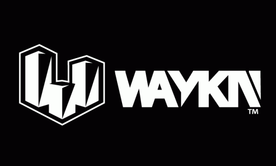
The thought process behind the logo on the left here is that it's kinda like a little city, three buildings all reaching upward to the sky seeking new limits to break giving people the ability to over see a city from the top giving them a better perspective or understanding of things. As for placement of these buildings I have them set up so they create W for WAYKN in a 2D perspective. The shadows on the building are on their right side. Suggesting that the sun is setting and it is becoming night time, a time where most creative thinkers or business men are still awake working to create something better or to be one step ahead.

Alignment changed as suggested by race. minor additions to logo. and change up on the look of the N to hopefully make it still look unique but take away from it being mistaken for an I without disconnecting it from the K entirely. I kinda made two different second versions becaue theyre vary similar to eachother but anyway, this is version #2
Thoughts?


5 Comments
I like this version better. Easier to read, more obviously an 'N'.
Thanks Waffles(: I'm glad it actually looks like an N this time XD
Sorry, but I read WAYKA at first.
And I'm probably catching the band wagon here, but I can't help but think that the symbol only complicates things. The word mark is already quiet complex and not easy to read. I don't see what the symbol brings to the equation. As you say yourself, the word mark it's kinda its own logo.
Keep it up!
ya I just opened it again and read it that way too -__- it's okay though not gunna stop me from getn this dialed in, The feedback you guys are giving me is great, please don't hold anything back!
The only reason for wanting another symbol is to have something that's not a word. something separate like abstract that I could use by itself. Like Nike basically. The swoosh thing like obviously they dont have the word Nike on every single product they make, other tan like the tag sometimes..okay and other times but i think you get what I mean...
I see what you mean. Maybe then don't use it as part of the logo but more like some kind of seal or badge.