Brands of the World is the largest free library of downloadable vector logos, and a logo critique community. Search and download vector logos in AI, EPS, PDF, SVG, and CDR formats. If you have a logo that is not yet present in the library, we urge you to upload it. Thank you for your participation.
Working Hero
jaybdesigns | Tue, 12/10/2013 - 21:13
Brief from client
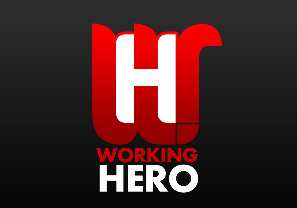
A logo created for a Norwegian multimedia company. The logo was to be the letters, W- for Working and H- for Hero, and they where to be infused
This is a pretty cool start. Some of your curves on the W could use some refining and your kerning looks like it needs some attention though. I'm not sold on the little tail coming off the right side of the W. I wonder what it would look like if you kept that the same as the other peaks of the W. Keep tweaking and you might have something here.
but the symbol is way too complicated. First, you could really play with the negative space instead of just imbricating the H and the W. Remove the fill and strokes from the H and just keep the big gap in the middle ascender of the W. The big plus with using the negative space is that it will be much simpler to put your logo on different background.
That tail on the W, as well as these two small gaps in the lower right corner are superfluous. I would get rid of them.
The text underneath feels a little disjointed from the symbol, which is flowing & has curves. The text (Futura?) feels rigid compared to the symbol. Explore some different type options. Aside from what's already been said, that's my only critique.
4 Comments
This is a pretty cool start. Some of your curves on the W could use some refining and your kerning looks like it needs some attention though. I'm not sold on the little tail coming off the right side of the W. I wonder what it would look like if you kept that the same as the other peaks of the W. Keep tweaking and you might have something here.
Thanks! you've literally opened my eyes with that comment, I will get those changes done and upload a 2nd version! thanks!
I agree with Jon, it's promising.
but the symbol is way too complicated. First, you could really play with the negative space instead of just imbricating the H and the W. Remove the fill and strokes from the H and just keep the big gap in the middle ascender of the W. The big plus with using the negative space is that it will be much simpler to put your logo on different background.
That tail on the W, as well as these two small gaps in the lower right corner are superfluous. I would get rid of them.
Anyway, good job.
The text underneath feels a little disjointed from the symbol, which is flowing & has curves. The text (Futura?) feels rigid compared to the symbol. Explore some different type options. Aside from what's already been said, that's my only critique.