Brands of the World is the largest free library of downloadable vector logos, and a logo critique community. Search and download vector logos in AI, EPS, PDF, SVG, and CDR formats. If you have a logo that is not yet present in the library, we urge you to upload it. Thank you for your participation.
Working Hero
jaybdesigns | Tue, 12/10/2013 - 23:55
Brief from client
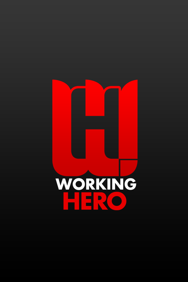
A logo created for a Norwegian multimedia company. The logo was to be the letters, W- for Working and H- for Hero, and they where to be infused
4 Comments
You need to remove the stroke from the H altogether, otherwise it's just defeating the whole purpose of having negative space.
The thing happening on the lowest right corner is complicating the whole logo.
I would also put more space in between elements. You got to let this logo breeze!
Keep it up!
Here's the idea, basically.
that symbol is waaay to big and i cant see anything in it.
but typo and colors are fine
What Shawali said. You're getting there.