Brands of the World is the largest free library of downloadable vector logos, and a logo critique community. Search and download vector logos in AI, EPS, PDF, SVG, and CDR formats. If you have a logo that is not yet present in the library, we urge you to upload it. Thank you for your participation.


5 Comments
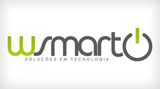
Try some bold and not fancy looking font. This mark doesn't say *technology*.
I see there's not a real, defined symbol for W Smart, so work on the wordmark first and leave the symbol for later.
just like luenib said, i stated in the other logo posted about being bold. it feels so bland. just like i posted in the other, the colors remind me of xbox 360, and seeing the power symbol reminds me a video game type of site logo.
Kerning is bad
tagline will be hard to read at an inch
fonts do not work
Star Over
nothing is working together....focus on typography and later on you'll make a symbol....in plus do a grid to your logo...
Nothing is new..but the typography is really good and the color choice is great