Pathway DTP
jarrad113@gmail.com | Thu, 01/08/2015 - 02:02
Brief from client
Starting a design/printing company. I will subcontract some printing and offer dtg on site. I put this together so I can start a FB page and web site as I need to start doing business.
I value this community and the insight offered so please let me know what you think. ..



3 Comments
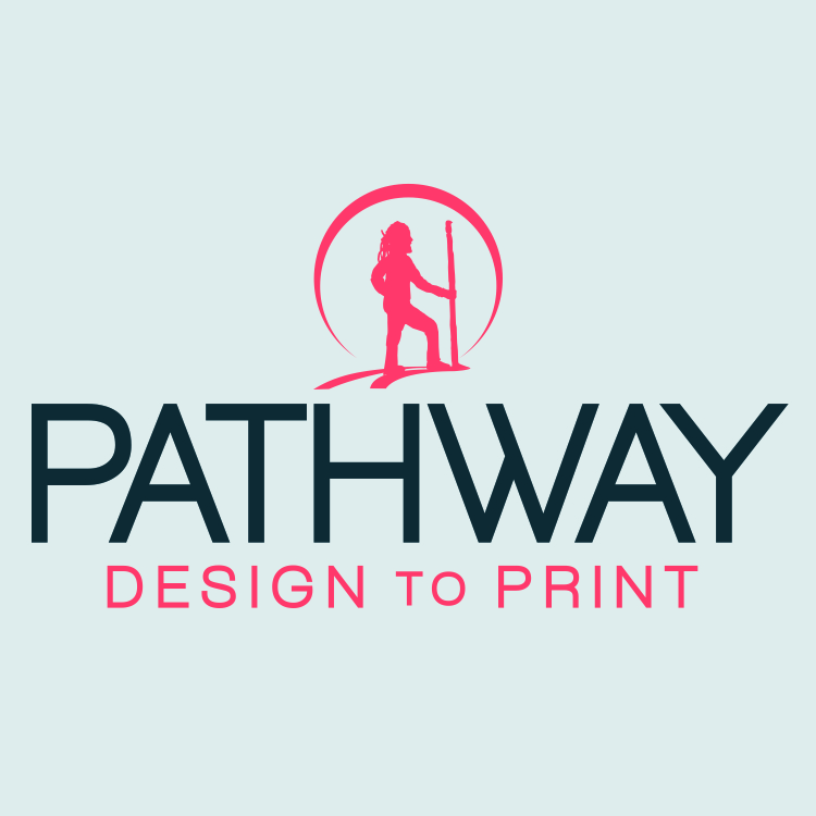
I am not loving the figure. The proportions seem off to me. The head seems big, the back leg seems short the back arm is odd. I could envision this with the path and circle but without the figure. Is it supposed to be a Native American? Lewis and Clark?
I am sorry, but those colours still do not match each other in the slightest.
http://en.wikipedia.org/wiki/Complementary_colors
You still need to work on the kerning, it has been off since 2 versions ago. Look at the space between the W and the A in Pathway. It is way off.
http://en.wikipedia.org/wiki/Kerning
The main problem with the symbol is the hair, or whatever it is, I'm not sure. Dreadlocks? Make it clean, maybe a hat, something without much detail, easy to recognize.
http://en.wikipedia.org/wiki/Hat
Still miles ahead of previous versions though.
I like the look of version 3 with the change of what is inside the triangle. I am not totally against the CMYK idea. It is over used but there are some great logos using it. What if the pathway was CMYK. A little more subtle. make it look like it is overflowing out of this circle or the triangle can look like the path is starting on both sides and receding into the triangle.
I do like the font but like everyone else said the kerning needs fixed.
Colors in this one are completely off.