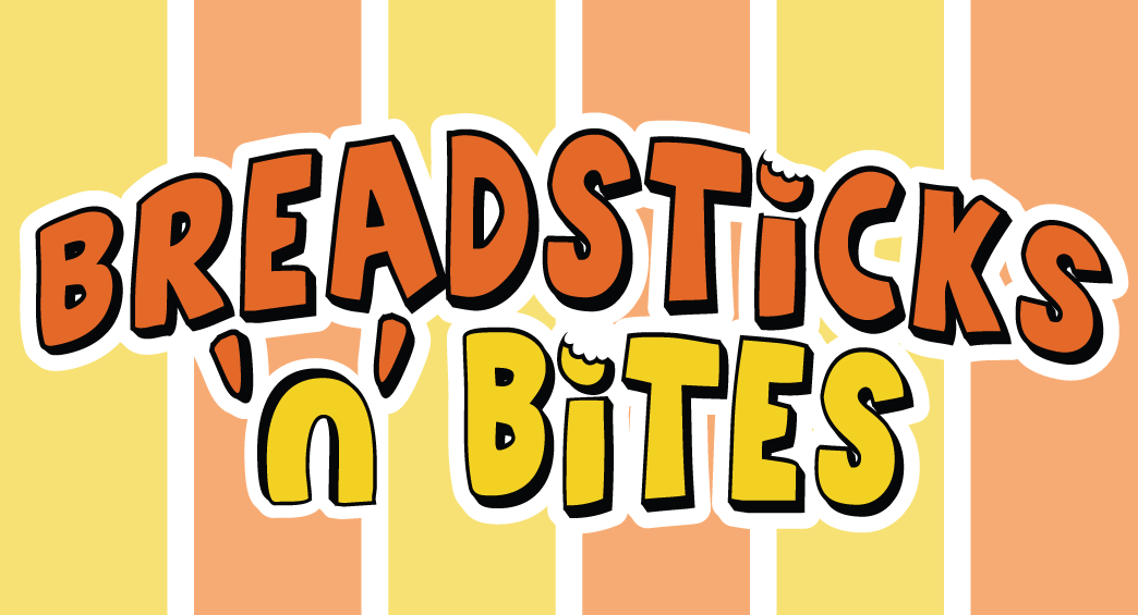
Breadsticks 'n' Bites
helenflynn | Sat, 07/28/2012 - 02:23
Brief from client
A quick serve mall-type Italian food restaurant is adding a baked snack section to one of it's stores. The name of this section is Breadsticks 'n' Bites.
The client wants the logo to be fun, appealing to children and immediately memorable. Examples he gave were Hot Dog on a Stick and Wetzel's Pretzels. He also wanted two colors in the logo that would be echoed through the decoration of the store and all paper products and advertising. Much like the way McDonalds utilises yellow & red.
This is one of my first attempts at logo design and I would really value any critique or suggestions.
Some changes I made since the previous versions I uploaded. All criticism greatly appreciated!
3 Comments
better the first one, i don't like the "n". Bites on points of the "i" are ok but resume it just to one of the "i"s. bring something more detailed as a bread loaf.
Thank you for your comments! In this particular font there is no lower case "n" so I turned a "u" upsidedown. I'm not it's biggest fan either, I think I will alter the letter to make it look better.
I wanted to put a breadstick/loaf in there but my client is against it.
I'll keep working on it!
I didn't really mind the capital 'N' being used- I'd almost be tempted to go back to using it and then just have the 'i' of "bites' with a bite taken out of the dot maybe!? These colors are nice and warm (and I think I like it better than the orange/green combo- not that that was bad) and the B and the S look the same size now! Good progress so far!