CodePen Dayton
ricardozea | Wed, 08/17/2016 - 17:14
Brief from client
Logo for the CodePen Dayton meetup
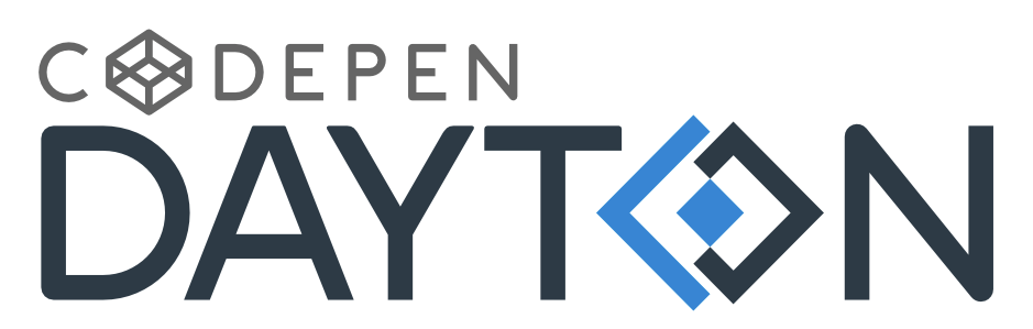
Integrated our "CD" symbol into our type to piggyback on the same principle used by the CodePen logo.
And reduced the CodePen logo to allow our name to be primary message while keeping the service we promote secondary but integrated without 'stealing the spotlight'.
4 Comments
The dreaded "logo within a logo" - logoception conundrum. Not using all the thumbs here because they are kind of irrelevant, you are stuck with the Codepen logo combo idea and the font, so what's left is how do you make it work?
I don't think an extra symbol in the name works on any level, just causes conflicting visuals. Your symbol is awkward to my eye, the blue shape being higher and lower than the grey and the tension point where they touch throws it off for me.
My suggestion would be relocate the symbol to the left of the text (as sized here with the O restored) with a thin vertical line separating them. Might be a standard well used approach, but sometimes that's what works. I just had to do something similar, if I get a chance I'll post it.
Hmm... I don't see it THAT bad TBH.
The symbol is the abstraction of "CD" which means CodePen Dayton. Now the shape is taller and longer from the baseline to compensate with the visual effect of not being long enough due to it's baseline being so small, just like rounded letters, they stand below the baseline of flat based letters.
I think the tension point is a plus, something to remember the logo by. It may or may not be something bad necessarily.
Here's a version based on your suggestion, not bad if you ask me: http://www.brandsoftheworld.com/critique/codepen-dayton-1
What do you think? (Please post in the version 3 page plz :])
As far as the logo in a logo...I read it as co depen...not code pen. this really just doesn't work for me.
That's an existing logo. Not much the designer can do about that.