Brands of the World is the largest free library of downloadable vector logos, and a logo critique community. Search and download vector logos in AI, EPS, PDF, SVG, and CDR formats. If you have a logo that is not yet present in the library, we urge you to upload it. Thank you for your participation.


8 Comments
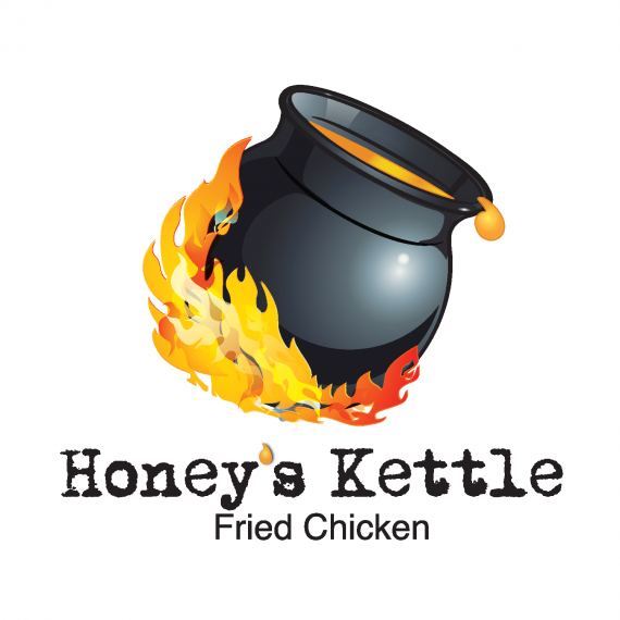
Good idea but the flames are really messy and the fonts looks way too "dafont-y" and plain.
Some serious fine tuning should fix that.
What sort of font do you suggest I use?
I think it would be a passable (forgettable, perhaps) if you just exchange the leached typewriter font for something better. I agree with Shawali: refine and simplify.
I presume the cauldron is your own work?
Yea its my work. I wanted to look very active, but i guess it is coming across pretty messy
No, on the contrary - I'm impressed.
If this were an illustration for a children's book or something- I would have given this all green thumbs. BUT - the font definitely needs to be switched, and the flames just need to be one color or way more simple. The cauldron is very nicely done, but even that might need to be simplified. A lot of detail gets lost when you shrink things down for printing. (Think of how small it would have to be if it were on a 2" x 3.5" business card, you know?)
I think you're on to a great idea, just play with a bunch of fonts (maybe an old fashioned looking serif font or something!? But that's just me; I think of southern fried chicken being eaten on a Louisiana porch in the 50's!), simplify the flames and maybe/probably the cauldron and put up another draft!
Is a clip art or logo?
dont use gradients
dont use rare fonts
dont use bad vector points