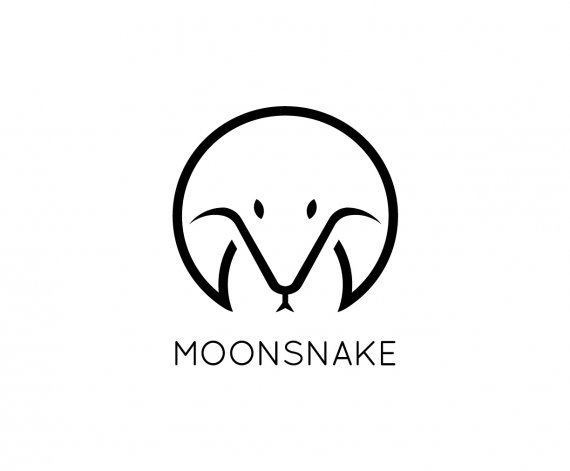
MoonSnake
ALIASII | Thu, 12/21/2017 - 08:21
Brief from client
N/A self appointed prompt

Hello! This is my first logo post to the site. I work as a graphic artist full-time for a promotional production company doing virtuals and vector mock-ups for clients. I also design and sell enamel pins outside of work.
I've been using Illustrator for a little over two years now, and I want to get into creating logos for StockLogos on the side (eventually). I'm new to the process and hope that I can improve and learn through this community. I'm open to critiques and roasts.
"MoonSnake" was all I was going off of. This version looks alcohol related to me. Or maybe something for an online shop that sells point pendants and candles.


9 Comments
Hello!
This is my first review. I just posted my first logo myself... please check that out if you get time.
I like where you went with this. I like to train MMA on my free time and made me think of an exercise related brand.. something I can see on boxing gloves or wrestling shoes.
Good work!
Thanks! I do not think my logo deserves a perfect score, especially since I quickly added the text without editing the kerning at all. But I appreciate your kind words.
Sports was actually something I took into account when sketching. Animal heads are very common with exercise and sporty logos, which is why I intentionally went for a neutral expression. I was afraid if I made the snake look angry, it would only be associated with sports. I wanted a logo open to interpretation, I guess.
Y'all banhammered Felix before I was able to make a Full Moon joke. :C
If anyone is curious, here's the process in Illustrator after the sketching period. I initially had much more detailed graphic of the snake wrapped around a moon. It wasn't until I'd gotten pretty far that I realized I could probably scrap the entire body and incorporate the moon as a cobra hood.
I do plan on finishing the initial design and turning into a hard enamel pin. I'll redraw the head to a cobra at a 3/4 down angle, and have the moon decal on the back of the hood. The moon in the circle will be removed in favor of a knockout.
I would like to see a different font maybe for the title- the rounded one seems a little too "sweet" for the logo. But the symbol is quite nice! Good job!
Thanks!
I'm not fond of the font, either. It looks quite fine on its own. But I think it might be TOO generic in this context. I switched over to a bold blackletter. I think it looks decidedly Gothic now. So at least the theme is probably consistent.
Typography stresses me out the most. I never know what font I should use.
The first thing I saw is a fork-tongued hedgehog. :D How about a python squeezing the moon like the moon is its prey, with the bottom and top of the moon bulging out of its coils?
That actually sounds a bit like my WIP version, except for the moon bulging out part. I have it above in the comments, and am incorporating it into a different project.
A hedgehog isn't too bad. Someone else posted that the tongue made a butt, and now that's all I see lmao. So the tongue was removed.
LOL!! Now I see the butt. I laughed so hard I cried!