MoonSnake
ALIASII | Thu, 01/25/2018 - 09:17
Brief from client
N/A self appointed prompt
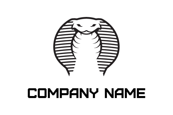
It's basically an entirely new drawing now. Not so sure about the font (I'm still pretty bad at picking fonts). But I'm happy with how the graphic image turned out. I tried a few things with the hood. but the bars across ended up looking best, even if the snake looks a little like a tire.
6 Comments
I love it! The first version was coo but this one is a slam dunk.
Maybe you could fine-tune the way the big outer stroke ends in the bottom part. It looks cut off, unlike the inner stroke which ends more subtly.
The fonts fine.
Good job!
Thanks!!
There's probably a few areas I could have still tweaked. But this version actually got accepted onto Logoground. Not that I'm complaining!
Congrats! Well deserved.
That being said, I'm having mixed feelings about this type of sites. There are some awesome logos, which must have required a lot of work, that are sold for a ridiculous price.
Wow! Look at your progression! Great job! Not sure about font choice but I like the positioning. Perhaps, something a bit more rounded to work with the smooth lines of the cobra.
One suggestion, you are dealing with a significant amount of negative space in the middle, which is not necessarily a bad thing, yet, to push the Cobra even further, I would definitely try toying with the distinct, slim, split (forked) tongue it has. Could be something.
Nice job Mate.
FIERCE!!! =)
Way to stick with it!
Cobra Commander approves!