Pura -Premium cat food- (pronounced "pure-ah")
natman462 | Fri, 01/13/2012 - 22:51
Brief from client
we sell top quality cat food. We want a clean elegant logo which portrays our company to be the cream of the crop.
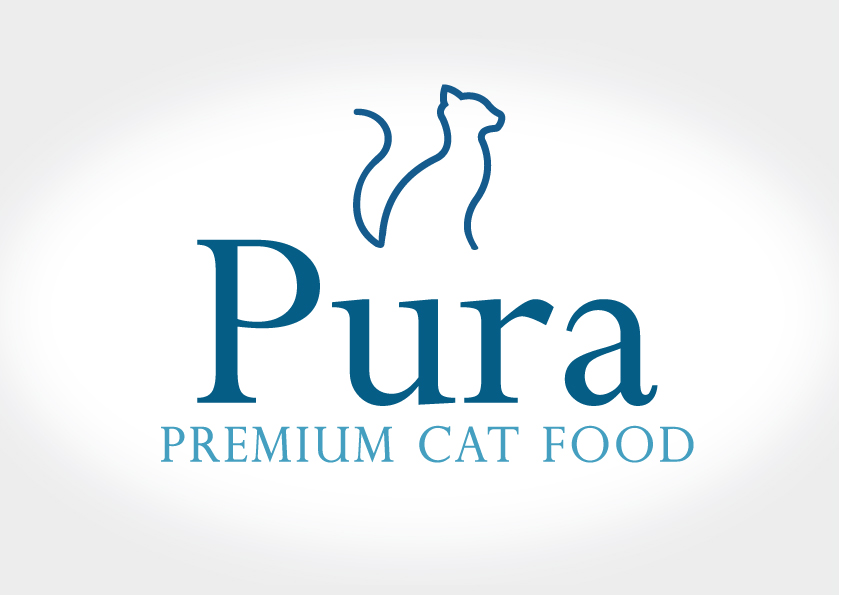
Nor sure if this is getting any better. Im trying to go for the simple cat silhouette
7 Comments
I think this is a huge improvement, your client should be pleased with this
So better.
Nailed it...
The thin lines of graphic mark are clashing with the thick Pura typography.
Another thing, your letter spacing & kerning is not good, thanks to your choice of serif typography you have a huge gap between P & u and you cannot do much about it and it will keep sticking out.
Following that monotonous and incomplete outline of the cat not finding a change in mood makes me think that perhaps it's making more damage than good.
I would stop for a minute and think about it again.
your idea is good nice try,....P transform to a cat. not bad, a little bit off balance sorry, you need to go far from your work to see what i mean,....and think about it.
i like your colors its more relaxing to my eyes need to work to that "Pura" the capital "P" engage to "ura" i think is not good,what if your capital "P" make it bigger then the letter "ura" push it intowards to capital "P",and one thing, something bother me about the cat i think its a little bit off to others, the position of the symbol is a little bit off try to change the position......its like the cat its alone...
The only thing I don't dig is the font. I would try some other options. Maybe something more wide tracking.