Self Branding
TNTraek24 | Thu, 07/30/2015 - 17:58
Brief from client
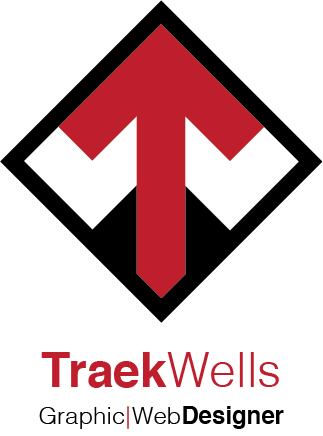
Since I was my own client, I wanted my logo to be clean, professional, and use one color (if any). I also wanted my logo to graphically say something that represents me as a graphic designer.


11 Comments
You know, this works for me. I know some of us are going to think, "wow, another logo with two initials cleverly combined in the symbol." But this can easily be viewed as a neat arrow icon, and later discovering a deeper connection with the name. I definitely had an "A-ha!" moment when looking at this.
Your typography, however, needs work; it's not quite there. A few things I noticed were:
1) It's about 50% the size it needs to be. Definitely make it larger to counterbalance the weight of the symbol.
2) Too many font weights used here. Subtext doesn't need to be decorated all that much, if at all. Also, maybe just shorten it to "Graphic and Web," as a suggestion.
3) I'd choose something besides Helvetica as a typeface. It's just done to death, man. It's a beautiful font, but give your logo a bit more individuality. Choose something that compliments your icon's letters. You've got a wide "W." There are tons of beautiful typefaces with wider letters that could work.
That's all I've got. Great work overall. Been seeing some great work in the critique section lately. :)
Thanks for taking the time to give me a critique. I've historically struggled with type and feedback like this is sure to get me over the hump eventually. I've reworked the text and I will be adding a new version. Thanks again!
I agree with everything TheKillswitch said. I, too, have been critical of initial logos, but this does work because the initials seem almost secondary to the symbol. Nicely done. I look forward to seeing an update.
Thanks for the critique. It's funny cause you don't really realize how common initial logos are until you start checking out other designer's portfolios. I'm glad you think mine works.
same as above, my first thought was holy crap the symbol is too big ;0
you could seperate your subtext with a & instead of a bar :D
Thank you for the feedback. I reworked the type but I was never fond of putting the '&' in the subtext. Since my logo doesn't have any curved lines, I think it makes it look like it doesn't belong. Maybe I'll try and spell out 'and' instead though. Thanks again for taking the time!
Maybe a diamond bullet?
Interesting, I never considered that. Thanks.
What about the T (shaped like an arrow) to separate the subtext?
Then the same goes for a " T " in " TRAEK " - isn't ? That might be a thought?
Then the same goes for a " T " in " Traek " - isn't ? That might be a thought?