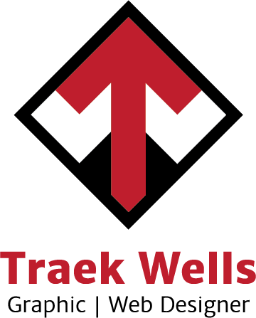
Self Branding
TNTraek24 | Fri, 07/31/2015 - 16:42
Brief from client
Since I was my own client, I wanted my logo to be clean, professional, and use one color (if any). I also wanted my logo to graphically say something that represents me as a graphic designer.


4 Comments
Closer. You resolved the size and weight issue. I'm still not sold on the font. Myriad Pro is also a very common font.
Also, I believe that diamond bullet would work nicely here. Although "Graphic" seems a bit awkward when separated from the rest.
Keep at it! Good improvement.
Thanks for sticking around and giving me feedback. The font choice is going to be the death of me. Lol. It does seem the word 'Graphic' seems a bit out of place, I'll keep that in mind.
Hi, Your logo is in the final stage, still needs some improvement. The Symbol looks too big in proportion to the text. Make symbol and text in proportion. and also choose better font.
In subtext only Graphic word feels awkward to me too. I will suggest to use '&' instead of '|'. Make subtext little smaller and add spacing in it.
And color combination is better, but try different shade of these colors.
I'll play around with different color shades, I think making the red a tad darker might look better. I really want to avoid using the '&' because of the curviness of the shape but I'll try it out in a different font. Thanks for taking the time and giving feedback!