Unión de apicultores Hidalguenses (Hidalgo State Beekeepers Association)
Brief from client
Unión de apicultores Hidalguenses (Hidalgo State Beekeepers Association)
Hidalgo State Beekeepers Association is a group of beekeepers that use their bees in two different ways: they help farmers with bee pollination, and they produce honey as a product to sell.
Hidalgo State Beekeepers Association logo needs to be the brand that will back up the honey brand “apibella” but also must back up the association as pollination consulting group for farmers.
It´s not mandatory but is suggested by the client as a consideration to represent wheat (because of the work with farmers)
Hidalgo State Beekeepers Association is highly concerned about equilibrium between production and environmental health, so they need to represent this equilibrium- duality between environmental care and efficiency in production (the production in the farms pollinated by the bees is highly increased in a natural way)
The colors are free to choose but the “gold” is recommended because of the association with honey and wheat.
The association wants a modern looking image

-OPTION THREE
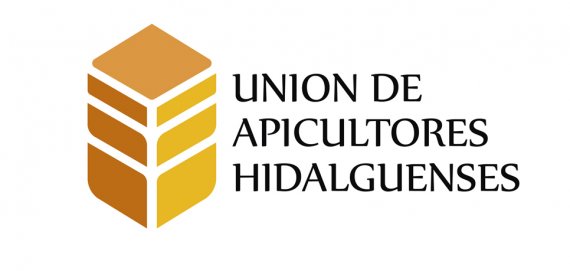
-From the initial client selection the icon in all versions became a mixture between wheat and a “Langstroth hive” (the most common beehive model) the icon is also represented in an hexagonal shape, a very common form in nature and also base of the hive cells
This option there are no lines indicating the wheat, the only indication is the more rounded shape in the base of the boxes
-There is no circle around this option looking for a visually lighter version
.
-Uses same typography as in option 2


5 Comments
The symbol is fine, not really memorable but it'll work
I would work on finding a cleaner font though, the placement is fine
Yes i agree with above, find a more cleaner legible font. as for the actual logo mark i believe you could create something more unique and eye catching as this one is alright at the moment but nothing great. Work on it, you'll get there eventually.
Symbol works perfectly for this but your typography doesn't.
Use a simple & clean grotesque font instead.
Nice and clean. I like it.
Thank you all for your comments, I will start a searching a better typography I’ll post the results ,
And again thank you