urmania ™, It's yours !
urmania | Mon, 09/23/2013 - 10:13
Brief from client
Specialties: Graphic Design, Advertising, Creative Concepts, Branding Identity
Specialties: Graphic Design, Advertising, Creative Concepts, Branding Identity
4 Comments
i dont really no what to say about this one.. I dont see much creativity here and i really dont like the font its way to generic. A U in a box doesnt say good symbol to me either. Im guessing you chose the magenta colour because your a woman? i would choose something more neutral so you dont target your company at woman only. I guess the only thing i do like about it is the name!
I think you need to pencil out some more ideas and think outside the box a little more! Keep working at it
Dear M@,
Thanks for your feedback !
For the name it is actually two words ( your ) & ( mania ), so it became urmania !
It is all about your real mania in your life !
For the color, it is not because I'm a women ! ... Totally wrong !
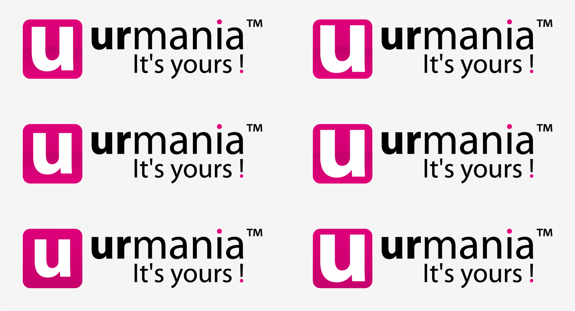
It was just the basic color, and as you can see on the attached file there will be many other !
haha! i think i like the orange colour best out of all these but i still think you need to come up with a better symbol. Something that says "you" but without it simply being the letter "U" and i would definitely try some different fonts
Unfortunately, there is nothing really happening with this logo, whatever the version.
It just feels like you went straight to Illustrator, without any prior thinking or sketching. What could be forgivable for a student is unacceptable for a professional agency.
The symbol expresses nothing, beside "we think inside the box". The font is really boring and the kerning is way off.
The base line is really badly placed and disrupts the reading. The apostrophe and the exclamation point don't help either. You're always better off avoiding having the baseline in the logo. You want to keep it simple. But not simplistic.
And please, remove that ridiculous TM thing. Or at least reduce it.
Even the name is weird. It would make sense if it was "our mania". But who is the "yours" for? Hypothetical clients? I don't see what "mania" has to do with anything. You have a major brand positioning problem here.
Sorry if I'm a bit harsh, but since you introduce yourself as a professional, there's no use in sugarcoating it. You definitely have some sense of aesthetics but you really need to improve your skills if you hope to reach a professional level.
Good luck!
PS : I meant to give you a green thumb for colors. Sorry about that.