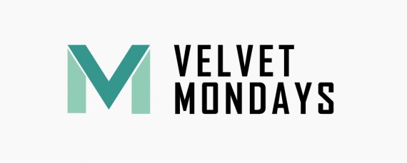
Velvet Monday
weejee | Thu, 05/07/2015 - 13:24
Brief from client
Velvet Monday is a worldwide recruitment firm with a focus on mobile product management positions. Their target audience is mobile product managers ages 30 to 45 years.

In my previous design the small v at the top of the M looked like a small heart and was superfluous since there already is a good visible V in the letter M.
I took all your feedback and came up with this design. Could you please be so kind to take a look and tell me your thoughts.
This is my first critique and I love how much response I'm getting. Thank you for all of your input.


10 Comments
This is better, but the spacing between the V and the M in the symbol isn't even. I am not fond of the font for VELVET MONDAYS, but I think you're on the right trace. The teal leaves me a little flat. Take a look at the psychology of color and make sure that's what you're trying to convey. http://www.empower-yourself-with-color-psychology.com/color-meanings-in-...
Hello Cooperads, thank you for your reply. I've taken a look at the psychology behind colors and I've adjusted my color scheme. Would you like to take a look at my most recent critique and tell me your thoughts?
That's the idea, is going very well!
try new fonts and colors.
I do like this direction. It is obviously a v, then you see the M!
The font is much nicer and more unique than in other versions.
The symbol needs just some tweaking.
The colours are nice together, but I don't really feel them as a logo. I think that being bolder with the colours may be to your benefit. Remember, the logo colours should be all over the restaurant, menus, walls, everything. Try to be bold and complimentary.
I tried this, to keep the teal, but you know better what the 'feel' is they are looking for!
Good luck, great to watch your progress.
(Side Note: I still like the teals together though. It is growing on me.)
Hey Waffles, thank you for your reply. I appreciate you reminding me that this logo could use some boldness. In my most recent critique I've chosen a whole different colorcombo. Maybe you could take a look and let me know if I picked up your feedback to your liking.
i like that one nice job
Nice! I think a more "classy" font would look better and maybe u should put the "M" a bit closer to the name of the company.. or add a small line between it. The colours can be a bit more fresher right?
Almost there!
Hey Snickers91,
I like your thinking. For my most recent design I've chosen a serif-typeface. I do like the result, I hope you do too. I've also chosen a fresher color scheme. Hopefully you'll like it.
I'm still not sold on the symbol. Looks overly bland and plain to me.