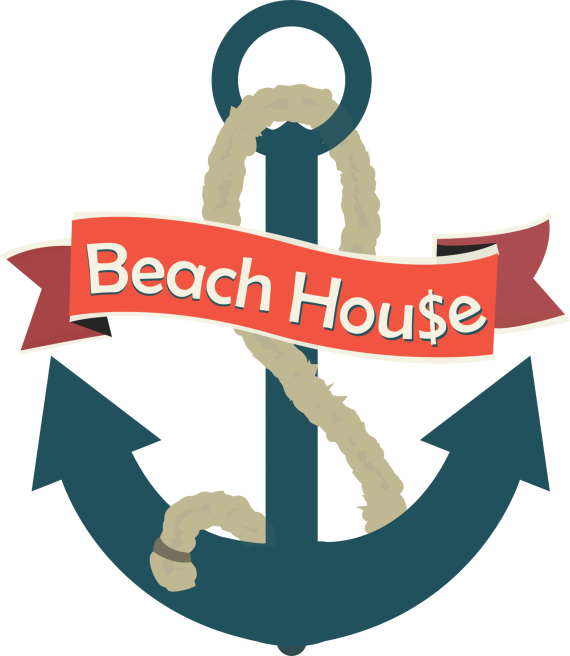
BeachHou$e New Look
Brief from client
The logo is for a clothing line named "BeachHou$e", and the only real requirement from the client is that the S in House be a dollar sign.

Phew, finished this total new direction with the logo.
I began by looking for an anchor inspiration (thanks for the awesome logo site references, guys.)
Sketched it out piece by piece, and decided to add a decorative banner to house the company name.
Scanned in my drawing of an anchor, and used illustrator to vectorize it.
I did a search for color schemes, and found this rad beachy-type scheme.
I saw a quote from the awesome Shawali, "Contrary to what you might think, Illustrator, or whatever software you use, is not a creative tool. It's only there to execute an idea you already have shaped up on paper."
Something about that quote just clicked, so here's another go at BeachHou$e.
Any critique is greatly appreciated. :) Thank you!


7 Comments
Wow, this is a huge improvement! You are definitely on the right track here. Nice choice of colors.
It's far from being perfect though, as many details need some serious tweakage. Globally the execution is a bit too sloppy, especially the banner and the font work.
Their a struggle of proportion between said banner and the head of the anchor. I would reduce the width of the latter, so it doesn't overshadow the word mark.
I would also rework the rope. The details are too messy and random. Know that with this kind of mini spikes all over the place, printing and embroidering will be a bitch. Keep it simple. Here's a few examples of what you could do with it : http://tinyurl.com/la8zf4e
I circled bellow a few details that need your attention.
Keep it up!
PS: I know it's client requirement, but the $ sign is really cheesy and gimmicky. I'd tell the client he'd be better off without it, as it brings or says nothing good about the brand.
Thanks Charlie!
This is very helpful information. I appreciate you taking the time to review each of my thousands of revisions. :-]
I'm working on these tweaks today.
P.S. - Progress is being made on learning how to make a realistic rope.
WHOO!
Watchout the strokes. You want to avoid them suckers! =)
Aww mann i really digged the bottom shape of your other logo. I'd hoped you'd clean up that logo and keep the bottom pointy shape of the anchor. This looks way to cheerful. As long as you and your client are happy i guess :D
I'm still playing with both ideas, one a more cheerful version and then the more badass looking version. I uploaded a new version of the "assassin's creed" anchor after this one; check it out!
I saw it. And i gotta say although its much more cleaned up i think you can clean it up even more. You're definitely set on the right track now tho. Just one thing about both your versions; with both the typography isn't working it looks like its just been pasted into your logo. Blend it in with your logo. But definitely keep at it.