BeachHou$e New Look
Bajistock | Wed, 10/08/2014 - 00:47
Brief from client
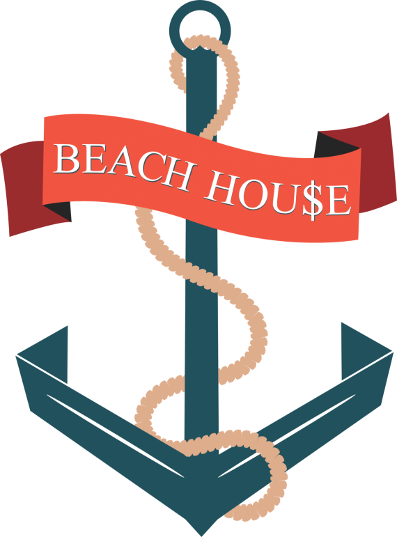
The logo is for a clothing line named "BeachHou$e", and the only real requirement from the client is that the S in House be a dollar sign.

New version, with the brand name added (and that darn tacky dollar sign. Ugh).
The text is a simple Serif font, as was suggested to compliment the sharpness of the anchor.
I also redid the rope to hide the ends, instead of leaving them dangling.
The banner, I removed the white stroke and also left the ends flat instead of "torn".
Thanks again for the help!! Any and all thoughts are welcomed. :-]


8 Comments
Baji this could work :) I like the little adjustments you did to your previous version. But i just had a sudden moment of clarity while looking at this. Like everyone said the dollar sign is a huge downside of this logo. So would it be a possibility to play with it and do something with the dollar sign? Like make the stick a harpoon? Or anything related to the theme? :D Keep up the progression!
LOVE this suggestion - uploaded a new version with the harpoon spin.
Tell me what you think!
Why don't you just simplify the whole thing and just have a simple word mark with the $ sign? And then you use the bar of the $ sign to create the anchor. I think it could be a natural evolution of that track you're on. The $ sign would still be there but it'd kinda tone down by the anchor.
Something like this.
It doesn't read well as a dollar sign that way, I don't think. I much prefer the anchor symbol personally.
I played around with this concept some; I also think I found the font I want to use for this project. It's called "Audimat."
Thoughts?
I think the typeface would work wonderfully with your current mark. However, as I thought the entire concept with turning the S into a dollar sign (as well as incorporating the anchor into it) turns one problem into another; The dollar sign is far too decorated now. That's just my opinion. The type on that idea is nice, though. I might change the diagonal line divider, but that's about it.
I have to agree with you, I think it's just too much pizzazz on the S. It kind of throws off the balance of the whole thing.
I'm updating one last version of this logo, with the new font swapped out and a new touch on the dollar sign.
Thanks for the input!
My last change would be the font for Beach House. I think you might benefit by using a bolder, sanserif font. If this is to be used for a clothing line...on a collar tag for example, the serifs would get a bit lost...bolder might be better. The rope still needs work, it looks a bit like a piece of yarn. There are some excellent tutorials on how to create rope in Illustrator...or even illustrator brushes that create rope...but keep it simple rather than highly ornate.