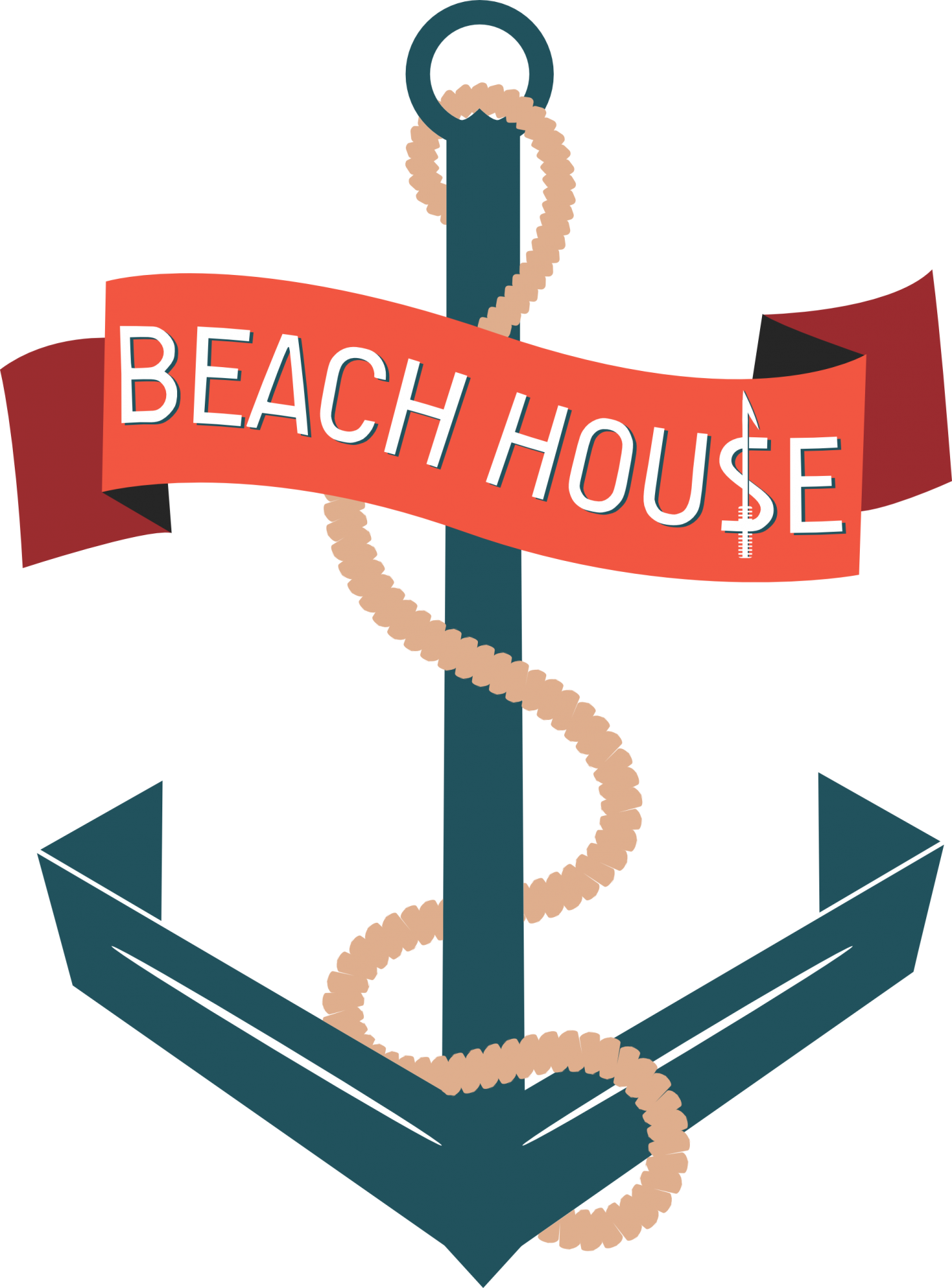
BeachHou$e New Look
Bajistock | Wed, 10/08/2014 - 21:49
Brief from client
The logo is for a clothing line named "BeachHou$e", and the only real requirement from the client is that the S in House be a dollar sign.
This will likely be the last version of this logo I upload, I think I've flooded the critiques with enough anchors for a while. ;-]
I changed the font to a stronger type, as well as incorporated a harpoon into the dollar sign to try to keep the same oceanic theme.
Can't thank everyone enough for the help and critiques on this, I've learned a LOT the past few days and have more confidence moving forward as a designer. If I could send everyone here a gift, I would!
43 Comments
Nah, you're just adding another symbol. The $ sign already complicates, but the harpoon just makes things worst.
Also, the banner still looks a bit too flimsy and so does the text.
And like someone said on the other post, I'm not sold on the rope yet. Looks like stacked up cookies. Try a uniformed shape.
I also preferred the more roundish anchor. This one I find too aggressive, but that's just me. I still think that it stills overpower the word mark.
Hmm. The harpoon is okay toward the top (the "barb" of it). Kind of feel the bottom of it looks too busy.
BUT, we're finally reaching the end result. Here are some finetuning suggestions:
1) Watch the segments on your rope. I see some gaps here and there, shouldn't be terrible to adjust.
2) The text is much better. However notice that it doesn't curve quite as much as the banner in some places. So I would tweak the banner shape or the text.
3) Is there SUPPOSED to be a small point inside the loop on the top of the anchor? It feels like it should simply be a round ring.
4) This is an optional thing, but it's just something I feel I would definitely do if this were mine: Where the corners of the anchor bends inward, I feel like a darker blue should be there, like you have done with the banner folds with the darker orange. Of course, this wouldn't make sense with a real anchor, but it seems to emulate a paper crease, and it would be neat to apply the shading to accompany it. That's just me.
Other than those nitpick comments, fantastic job!
Lets see here.
Yes this is how i imagined the harpoon would work but like Killswitch said, i think its too heavy towards the bottom just remove the flimsies down there and it shouldn't draw that much attention towards it. The ribbon is still too clunky. Did you see my comment on your other version of making it rounder on the edges? Don't remove this version of the ribbon just try it with rounded edges.
Also as far as the looks of the rope go the guys here are having mixed thoughts about it. Here's my 2 cents, i do think you have some roomy spacing going around at specific parts of the rope which you should look at but it isn't really that noticeable or bothering. And as far as the look of the rope goes i think it looks good like this adding anymore detail or making it more sophisticated will just make your logo heavier. You don't want that.
But i think you can finally see the finish for this logo up ahead soon!
Agreed about the rope. My comment was simply an "attention to detail" type of thing.
Im sorry to put a downer on this but ive sat back and seen all the progression and comments made - agreed you have improved it a lot but for me when i see this logo i think it screams amateur.
1) way to many colours
2) over complicated
3) badly drawn illustration
4) anchor completely overpowers the text
5) the title is Beach House yet you have an anchor from a boat - i dont think that fits with the name properly
I think you really need to sketch some more ideas out and neaten everything up. Concentrate on the name of the company and try to find something that ties in to it better than an anchor (ive seen a billion logos with an anchor in them) Perhaps the main focus should be the $ as this in itself is a symbol.
Anyway thats my 2 cents worth :)
Allow me to defend the piece a bit.
1) Color doesn't matter too much here. I see three (four if you count white) basic colors here, including a few shades of orange. Not too bad in my opinion. I'm sure the artist can easily make a black/white variation of the logo. Not an issue here.
2) I would only agree here in regard to the harpoon shape and possibly the rope.
3) Badly drawn =/= stylized. In previous versions, the artist had a more generic and common anchor shape, and I think it paled in comparison. Is it your typical anchor illustration? No, and I don't think it should be, either. Anything to help set it apart helps.
4) A quick fix here would help. I too thought that maybe the banner could be enlarged a bit to remedy that.
5) I've been associating this with a cruise line myself. I don't think that's too far off from a beach theme. Beaches associate with the ocean, which associates with boating. I trust the artist has verified this with the client by now.
All valid points.
do you agree that it looks amateurish though? if so then i think all the points i made are valid as they are what is causing it to look that way.
I dont no how you can green thumb everything unless you have little understanding of good logo design
I don't think it looks like a top-grade professional logo, but I don't think it looks amateurish either. And trust me, I don't like the thumbs system. Especially when you can't change them. I would have much preferred to leave 4/5 stars or 3/5 stars in some aspects. Maybe I'll start doing that, and not leave any thumbs up or down. But I digress.
And I won't question your grammar/spelling issues based on a quick post if you don't call into question my understanding of good logo design based on my opinion. Deal?
No Deal.
This is not a question of good or bad English. It's a question of whether this a good or bad design - to which its the later! Its also a question of do you no what good design is or not, because based on all your comments so far i am struggling to find a yes out of it even if it is on your opinion
Indeed M@ and I (and i saw that Shawali also had some disagreements) are quite some time on this forum and I've never heard so many different opinions since you and another user have joined...
I'm fully with the opinion of M@, certainly with point 4.
The symbol is so big, even in the thumbnail i barely see the text. If you wanna keep this idea i would shrink the symbol and find an other place for the text.
To Charlie, webhunter and M@, thank you for your constructive criticism. I'm the first to say this isn't a professional logo; I'm still fairly new at logo development, so I am grateful for you sharing your thoughts.
Honestly, the thumbs up and thumbs down is not what I focus on when I upload a logo to be critiqued; it's the substance within the comments from much more experienced designers that I pay attention to.
I appreciate everyone's support with this, every bit has helped me, and I'm sorry this has sparked a bit of an argument between you all.
Im sure you will learn a lot from the feedback but i just want that the feedback that is given has a certain quality.
Replying to M@ because of the horrendous website formatting shrinking our comments.
Do I need to start listing my credentials which speak for my experience as a graphic designer, or can we move past personal criticism? I merely used your spelling and grammar mistakes as a baseline to demonstrate that our personal flaws are, in fact negligible, and to judge one another based on those flaws is detrimental to the issue at hand.
As I said before, this logo is far from perfect, but it is also far from "amateur." I agreed and disagreed with your points, and addressed each one honestly and carefully. If you wish to debate each other further, feel free. But simply saying my opinion holds no water because you claim to think I know nothing about design backpedals the discussion, and does not progress the artist any further toward the desired end result.
To webhunter, I see absoutely no issue with different opinions. Absolutely none. To me that speaks about the diversity of our personal tastes and ideas, which collectively bring an array of options and possibilities to the table. It may also imply that any of us are "right" or "wrong," but I believe these absolutes are immeasurable due to subjectivity of aesthetics in general.
Okay let me just say what I think now, based on all the critic you have given I doubt your skills as a good graphic designer... and that bothers me, because it can harm the quality of the feedback and the logo.
And im not liking to say this because i do not know your work.
I've said this to M@ already and it is evident I'll need to also say this to you. If you're calling my skills into question, address a point specifically if your comment is meant to be helpful in any way or if they allegedly harm the quality of the feedback and/or the logo. If you're discrediting my opinion solely and ignoring the progression of the thread of critiques, you're not doing anyone any favors. Refute my arguments with counterarguments. Tell me why my opinions are invalid. Explain why my *CRITIQUE (not critic) contributes to a reputation of being unskillful.
I apologize to the artist that these comments have fractured into a personal debate; I'm trying to turn it into a constructive discussion but it's not working very well...
Why your CRITIQUE is invalid? scroll up and look at the first post of M@ and then your reaction. its just don't make sense cause you gave 4 thumbs! thats why i am agreeing with M@ second post.
Oh boy.
I feel as though I'm becoming a broken record at this point. The four thumbs is due to my inability to rate on a scale from 1-5, as well as edit my rating. But with that aside, I fail to see why a critiques validity stands on how high or low I rate a piece. On a scale of good or bad, I feel that this pieces's bad qualities are outweighed by the good qualities, but I am NOT saying that there are no flaws.
Saying "its don't make sense cause I gave 4 thumbs" is not a strong argument for how good or bad my critique is, sorry. Try again.
"I've never heard so many different opinions since you and another user have joined..." I cant feel but think that this is pointed at me Webhunter since we had a dispute this afternoon. I would like you to know that i am in fact a longer member then you on this good site. I just didn't bother commenting, just checking out the submissions. If your remark wasn't pointed at me no hard feelings.
Also everyone on this logo page can you just think straight? Most of us all are in the same creative world. No need to attack each other. We all have different opinions and different outlooks on how we see and interpret things. This obviously goes double for reviewing logo's. Some will like stuff while others wont of the same design, its life get over it.
This is also a page for logo critique, meaning anything that makes sense the hard truth and your personal opinion, goes. You just can't expect graphic designers with 20+ years of experience to post their perfect logo's. Of course newcomers will post stuff and will want feedback and support. If you cant handle that then don't bother coming back on this site.
My apologies Baji that we violated your logo page.
Thank you.
Well said.
"I fail to see why a critiques validity stands on how high or low I rate a piece"
Well i do see this. With this and your reaction i doubt if you can see a good design. Of Course all the logo aren't professional but with your feedback i don't know if to logo will improve. But starting to think thats a matter of standarts and not a matter of taste. So you will have other standarts then me, and i or you don't have the right to say which standard is correct. maybe thats the task of the client.
I hope you understand what i mean. because its hard to explain in an other language :)
"With this and your reaction i doubt if you can see a good design. Of Course all the logo aren't professional but with your feedback i don't know if to logo will improve."
See, again there's another general, vague statement with no substance or reason behind it. You're quick to dismiss an opinion, but when asked to refute or provide a counter-argument, you provide more vague, fruitless responses. You simply cannot expect your own opinions to hold any weight with no reason behind them. Otherwise you become equally invalid. See how that works out?
of course its vague, can you describe a good-looking design thats fitting in some more professional standards for me? with the feedback you gave on to this logo it would not helped it to lift the design to my ,reasonable, professional standards. but maybe it would fit your standards, in that case i will consider you as a not "professional" designer and have all the rights to doubt the quality of your feedback.
Is there not an other place where we can discuss this?
That made no sense. I'm done here.
Victory
How mature.
Thanks, are you angry because i told what i thought?
I don't feel any anger. Just disappointment in your ability to communicate.
I actually think you're right, The language is a bit of a problem. but let's just leave it here because the site is failing and I do not want to be enemies for life.
problem settled?
I never intended to be enemies to begin with. Somehow I've become alienated simply because you believe I have poor design skills.
AH-HA!
I've discovered your secret conversation. Booyah. :)
http://img1.wikia.nocookie.net/__cb20120402225423/random-ness/images/3/3...
*soft laughter rising*
Wow, I've never seen that on BotW. An avatar way into the grey margin. This has never been done before. =)
It helps to view the code of the page.
WOW.
Are you guys actually replying to each other?
Kind of amazed
This logo shall live in infamy, forever anchored in our memories.
The logo that broke into the very margins of critiques!
i'v come here to give my greetings from the far right site of this page.
It extends beyond the visibility, by the way. I actually replied to your last comment.
YEA. I also added my own reply. :)
I feel this site is on the verge of breaking down and waving a white flag.
Hah! This turned into a well run shit storm. I like that there isn't a single mod who's looking at this page issue.
WOW 32 new posts since i last went on! just quickly read through all of them now...YAWN!